Google is gradually rolling out a brand new logo. It's an opportunity to look back with nostalgia at the old markers of the group's visual identity.
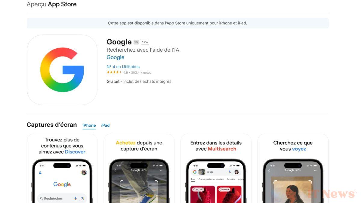
Google has discreetly changed its logo. The company hasn't yet announced anything about it, but the new logo can already be seen in a few places. Ironically, it was the Google iOS app page that let the cat out of the bag. When it last changed its logo nine years ago, Google launched a massive PR campaign around the reasons behind its design choices. This time, we have nothing to sink our teeth into, at least not yet.
Google's new logo retains the old G shape, but its colors are lighter, and more importantly, gradient. It no longer transitions abruptly from red to yellow or from green to blue; many shades now make the transition, for example, adding a touch of orange when going from red to yellow.
After 9 years of longevity, the Google logo is evolving
Most Google products have not yet been updated to match this new aesthetic. On its official website, the company offers visuals that can be used as illustrations for the press. The new logo does not appear here either. It is difficult to say whether Google prefers a phased rollout to test the new logo or whether this is a strategy aimed at generating curiosity and thus indirectly generating buzz.
This new logo certainly looks more modern and in line with current design trends. We will see in the coming days if it replaces the old one in new places and if Google will change the design of other elements to match them. Perhaps we will also be treated to an official announcement with proper explanations. In the meantime, we invite you to watch all the old Google logos from 1998 to 2015, the date of the last change before this one, in the video below.


0 Comments