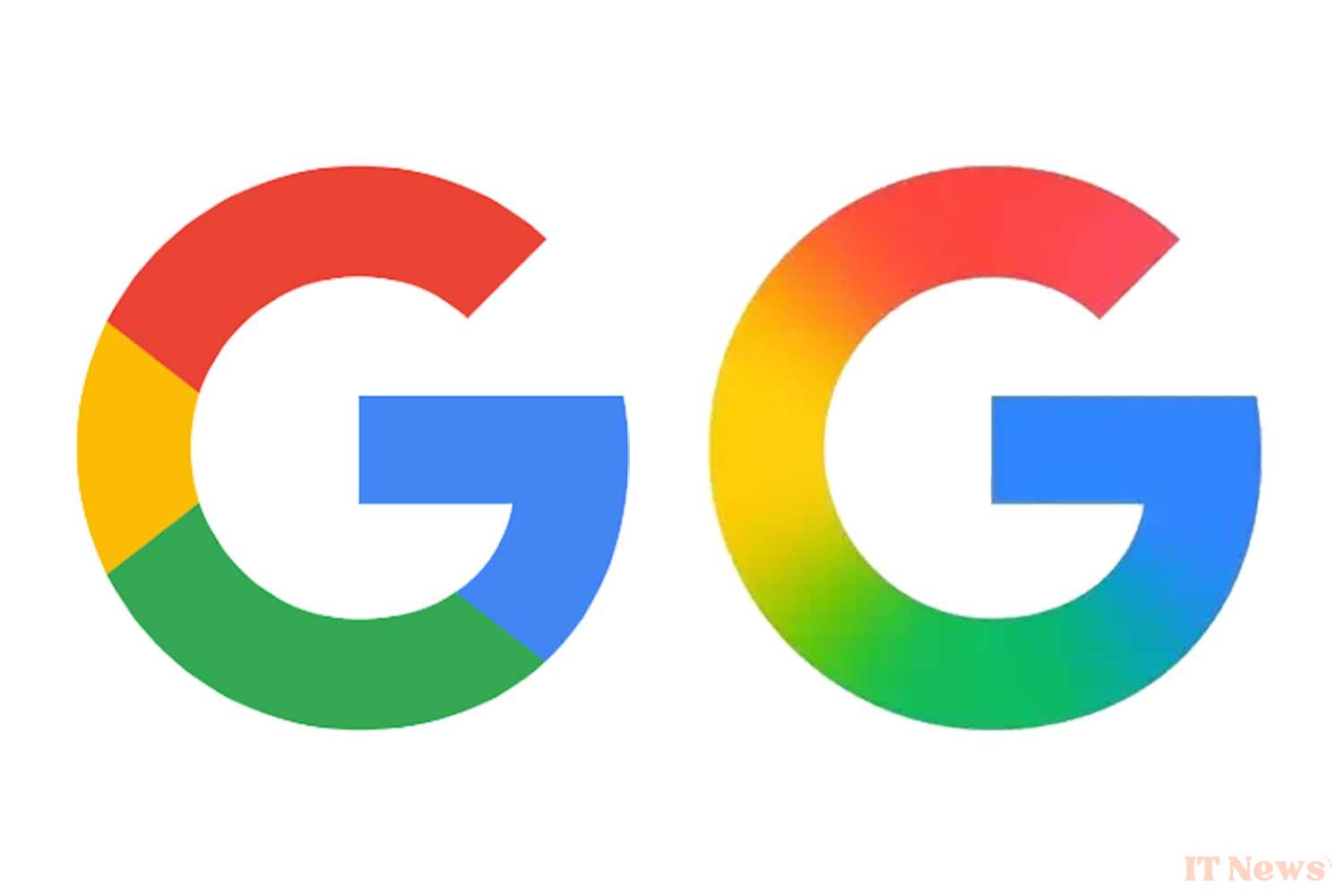
Google is modernizing the “G” icon that represents the search giant across many services and apps. While the change is subtle, it’s notable, as it’s the first design change in nearly a decade for the Mountain View company. The previous icon, introduced on September 1, 2015, replaced the lowercase white “g” on a blue background with the familiar circular design used ever since.
The previous icon, adopted in 2015, was recognizable by its four vibrant colors—blue, red, yellow, and green—arranged in distinct segments. The new version of this iconic “G” now features a more fluid style, and the colors are no longer in separate solid sections. They blend into each other to create a sense of movement and dynamism, with red blending into yellow, yellow into green, and green into blue. Visually, the icon appears more vibrant and colorful.
Towards a new graphic identity inspired by Gemini?
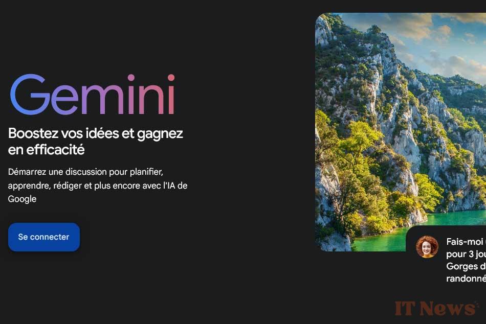
This design choice seems to be no accident and is in line with Google's recent visual developments, which tend to favor gradient effects and color transitions. This aesthetic is notably found with the Gemini assistant or the AI shortcuts present in the search engine. Google's goal is to deliver a consistent and resolutely contemporary visual experience, while maintaining the colorful DNA that makes the brand strong.
The new icon made its first appearance on the Google Search for iOS app. The most attentive users may have noticed this change. For now, this update has not been observed on Android or the web. The change is subtle and may not be immediately noticeable, especially when it appears in small size on a home screen or as a browser favicon.
Google hasn't made any other changes... yet
For now, Google hasn't made any other changes and the main six-letter logo has not been modified. However, it is not out of the question that this new graphic identity will extend to other products and services of the company. While it's still uncertain whether other product logos will change, Google's four-color logos, like those for Chrome or Maps, could potentially adopt this gradient style.
It's possible that the Mountain View company will take advantage of Google I/O, which will be held on May 20 and 21, 2025, to formalize this graphic change. Since its creation in 1998, the Californian company has regularly transformed its logo and icons to adapt to new uses and media. It also doesn't hesitate to make temporary adaptations to celebrate an event.
In video, the evolution of the Google logo up to 2015:


0 Comments