

Modifying the Windows Start menu is undoubtedly the riskiest exercise for the teams responsible for developing Windows 11. When the operating system launched in October 2021, the arrival of the Start menu in the center of the taskbar, and its new, much more modern design, confused more than one person. Microsoft, which plans to soon roll out a new Windows 11 Start menu, had to achieve this by performing a real balancing act. The teams in charge of the Windows 11 design had to go through several stages, which they detailed.
The Start menu, a cornerstone of Windows
First launched in Windows 95, the Start menu, which has become a true cornerstone of Microsoft's operating system, has ultimately been modified only relatively few times.
Microsoft carried out an initial overhaul at the launch of Windows XP, before revising its copy for Windows Vista. It was only with Windows 8 that Microsoft attempted a revolution, abandoning the traditional Start menu format in favor of a single home screen grouping its famous tiles. This interface, which was not very popular, ultimately pushed Microsoft to backtrack with a new, more conventional Start menu with the arrival of Windows 10, but which still retained a tiled display. Microsoft then modernized it by adding a bit of transparency to its tiles for a more modern look.
Until then, the Start menu had remained stuck on the left side of the taskbar. But with the arrival of Windows 11, Microsoft carried out a real revolution, moving the Start menu to the center of the taskbar. A decision justified by the need for better accessibility to this element, especially on machines with very large screens.
Since then, the Start menu has undergone several changes aimed at optimizing its use. The most recent one, which has not yet been deployed, but which Microsoft has since confirmed, will also reorganize applications by category, for simplified management.
But to get there, Microsoft designers had to go through several stages. They have just unveiled the different concepts they had imagined to meet the different requirements to be met in terms of user interface.
A Start menu with a thousand faces
In a recently published blog post, the Windows 11 design team explained the process that allowed them to validate the final version of the new Start menu. For this occasion, Microsoft designers have even decided to publish the various mockups imagined for this new version of the Windows 11 Start menu.
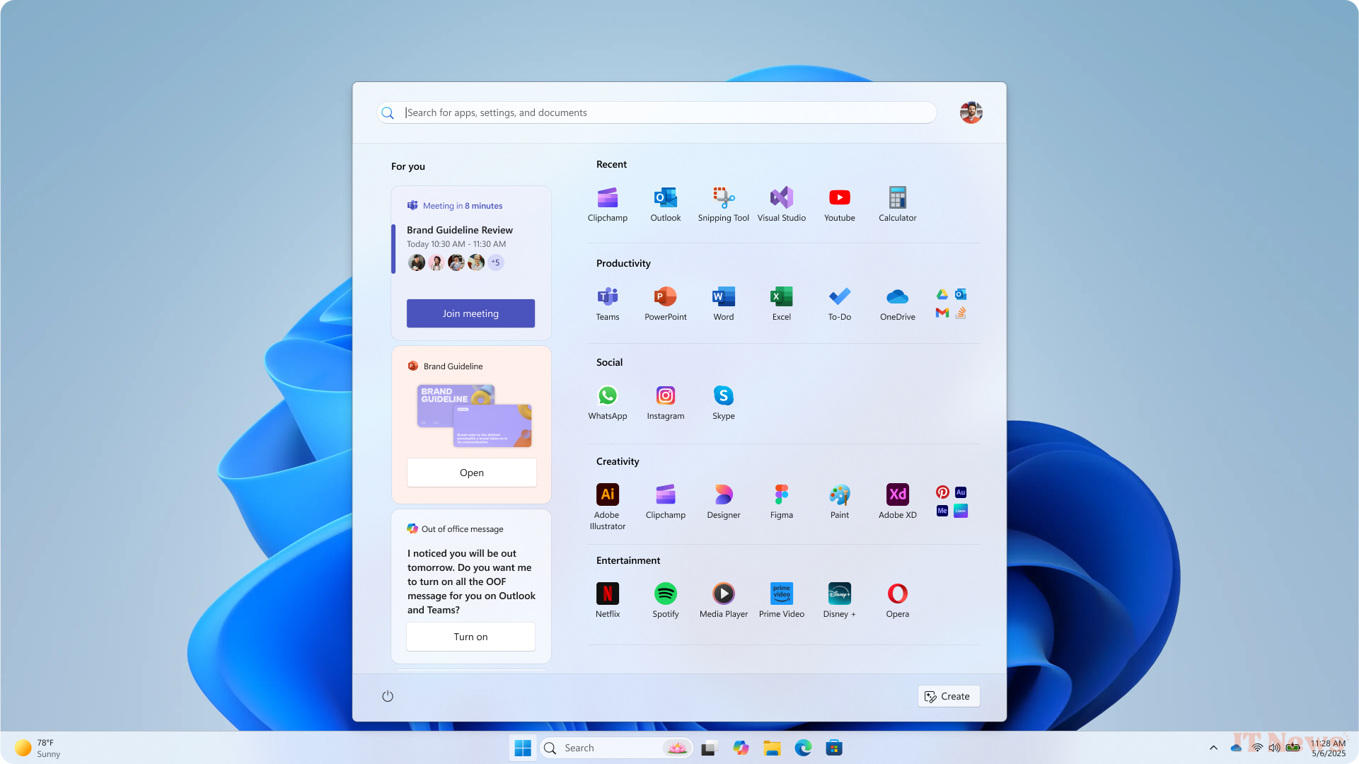
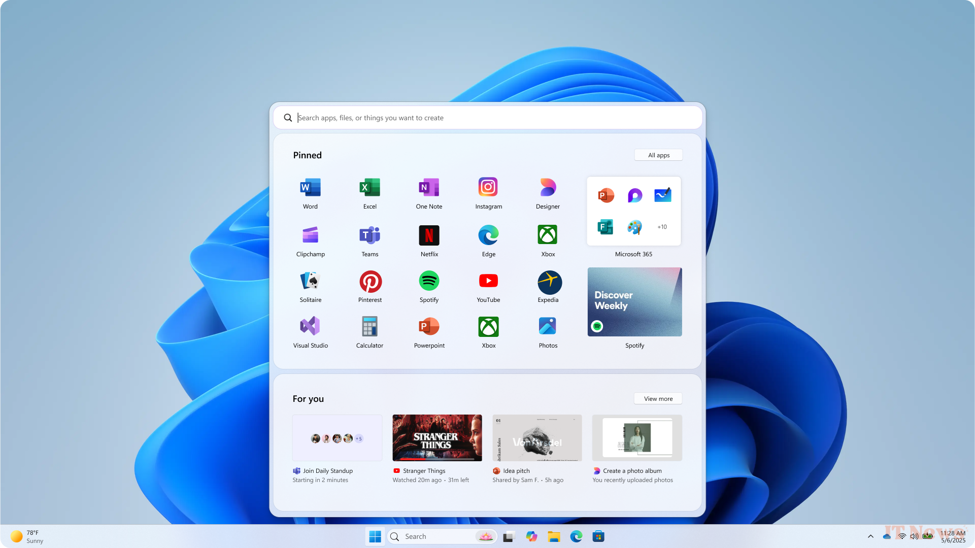
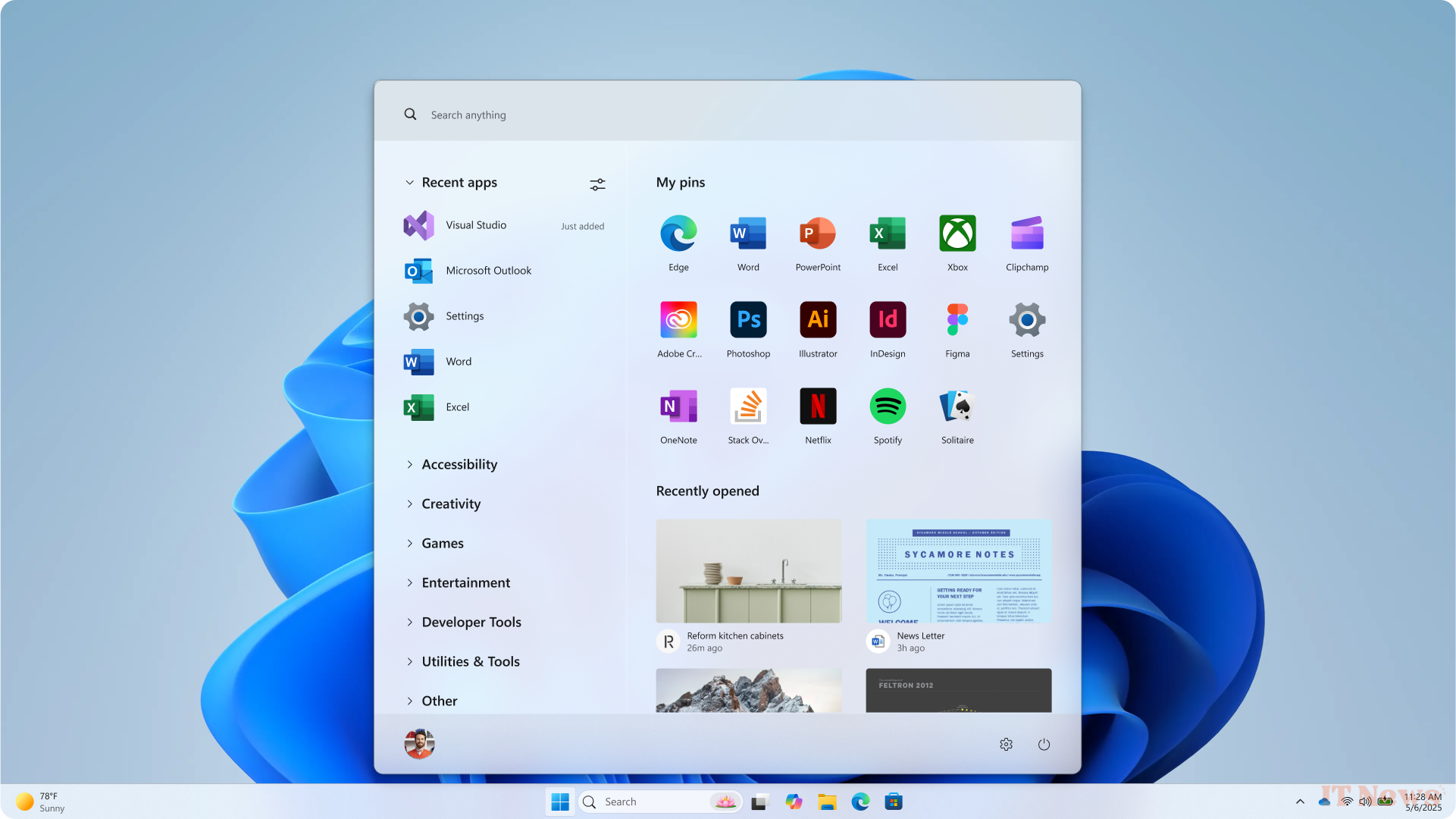
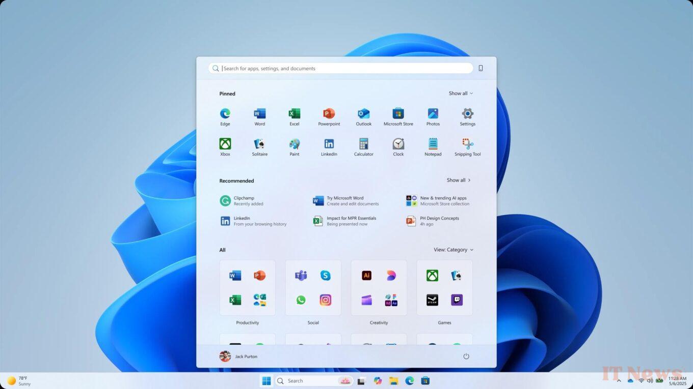
This redesign followed four guiding principles. First, all the applications in the library had to be immediately accessible. Second, the Start menu had to appear larger so that it only displayed what you wanted and needed. The Start menu also had to be practical enough to speed up your tasks, for example by offering frequently used items, and all this without disrupting users' acquired habits.

To finalize its project, Microsoft surveyed more than 300 Windows 11 users. The Redmond-based company studied their eye movements and took their reactions into account. Based on the feedback, the designers made the necessary adjustments to improve their ideal Start menu. This allowed them to make several improvements.
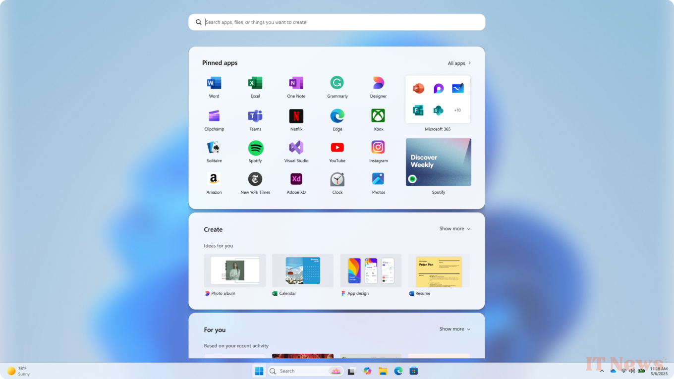
The "All apps" list has been moved to the top level of the menu, with three possible views. They then integrated smarter personalized recommendations, which learn in real time based on each user's usage habits. This is a way to offer dynamic recommendations for applications and files that appear at the right time. Greater freedom of control has also been implemented, notably to allow the display of more pinned applications, or more recommendations. Finally, a clear separation has been established from smartphone control, thanks to the arrival of a dedicated side panel.
To validate all the changes made, the interface of this new Start menu was tested on several ranges of devices. Everything has been designed to ensure that the display is as comfortable to use on a Surface Go screen as it is on a very large 49-inch screen.
Source: Microsoft


0 Comments