

By presenting Liquid Glass during the WWDC keynote, Apple swept under the rug the awkward questions surrounding its delay in AI (there are still some interesting new Apple Intelligence features). With this new design language, Apple isn't stepping out of its comfort zone: after all, the company is known for its work on form, whether for its devices or its software.
Goodbye iOS 7, no one will miss you
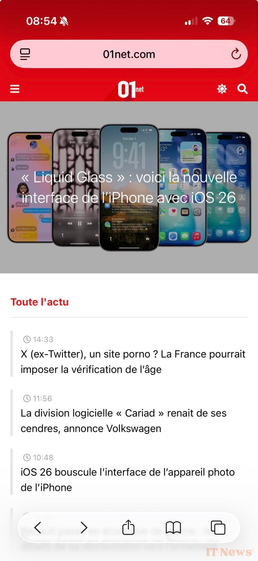
Although Liquid Glass is a software design, Apple compares it to a "translucent material [that] reflects and refracts its environment," capable of transforming itself "dynamically to highlight content." The design signature "makes even the simplest interactions fun and magical," assures Alan Dye, Apple's vice president of interface and the main architect of this transformation.
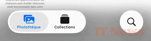
Beyond the big words and fine speeches, what is this Liquid Glass interface really worth? There is good and bad. In the first category, we can put the new icons. Gone is the sad and sanitized "flat design" inherited from iOS 7: the Camera app icon regains its former luster, the overlay effects, shadows and shimmering gradients remind us that the iPhone home screen is not just utilitarian, but a showcase with which we interact hundreds of times a day. So we might as well make it a pleasant experience.
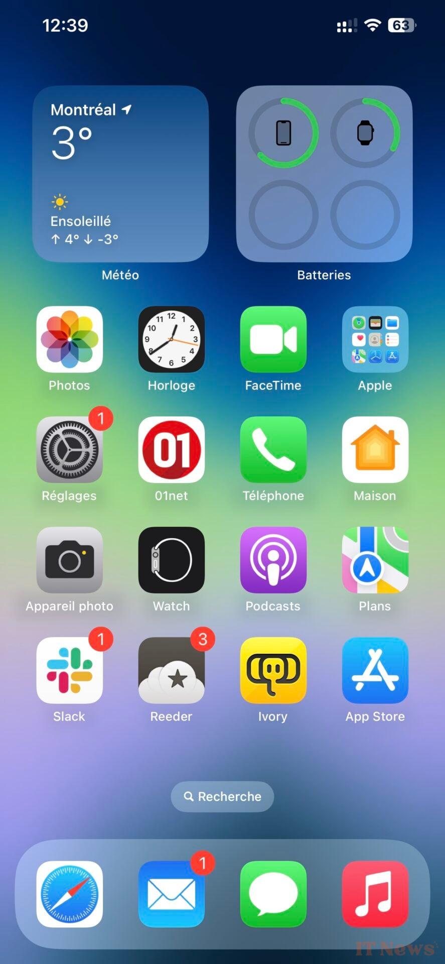
Below, the iOS 18 home screen (left), and the equivalent in iOS 26 with the default theme (center) and transparent (right):
Below, Safari in iOS 18 (left), in iOS 26 with the "top" tab interface (center) and with the compact interface (right):

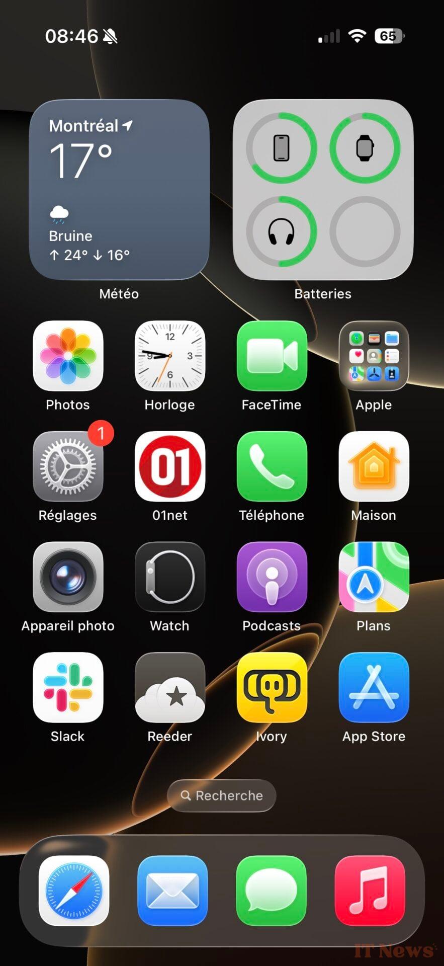
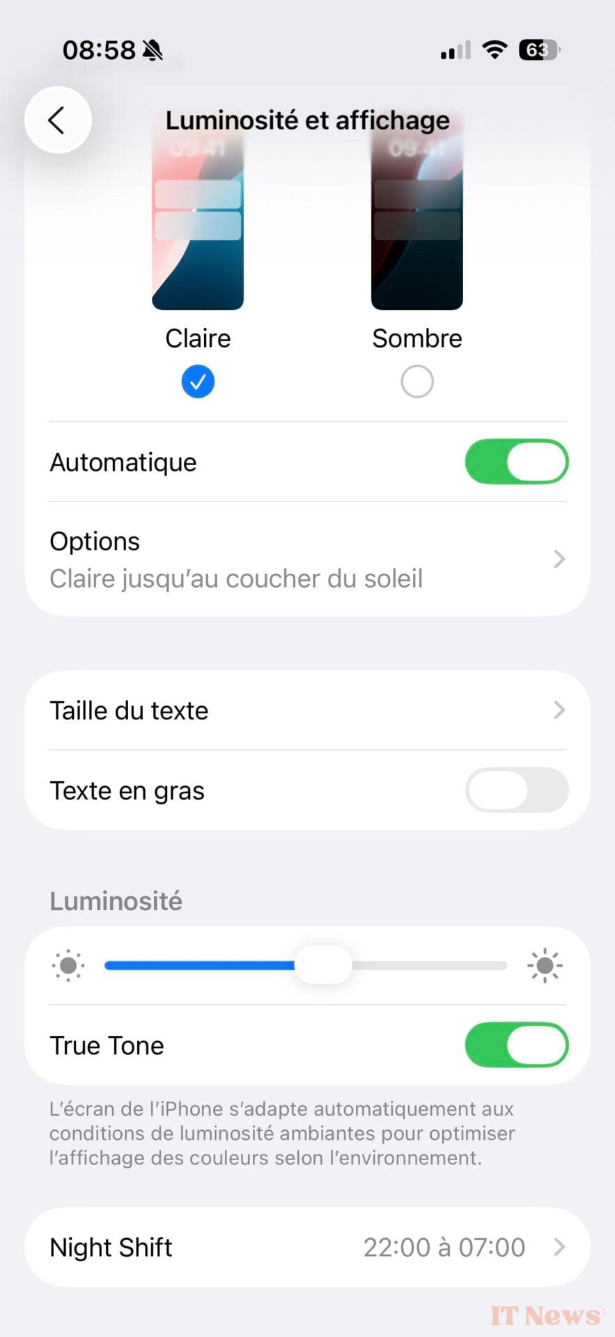
Below, the settings in iOS 18 (left), in iOS 26 (center and right). Note the presence of a transparent gradient at the top of the right window.
The icons also have the good taste of reacting to movements with a lighting effect on the edges. It's discreet, yet visible enough to play with the eye. The playful operating system also gives pride of place to animations that bring interactions to life. It's a pleasure to select an option or launch a pop-up window. The OS is becoming fun, something that hasn't happened since Aqua, the first Mac OS X interface!
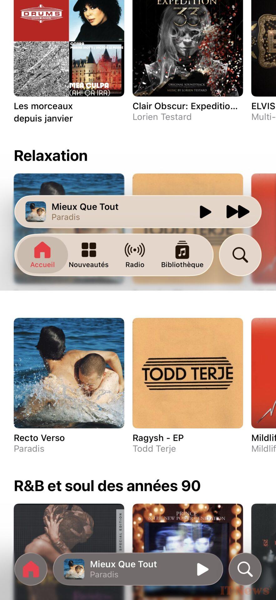
Translucent effects are literally everywhere, in notifications, sliders, windows, and everything that reflects what's underneath. Unfortunately, this doesn't work everywhere: depending on the image, readability issues can arise.
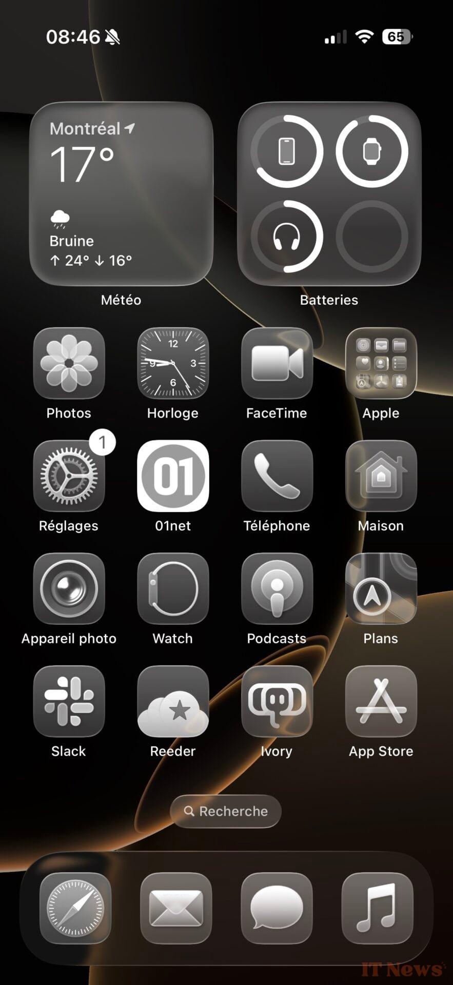
Apple still needs to iron out a lot of things; icon labels, and even glyphs, are sometimes difficult to read. There's an option in the accessibility settings (Display & Text Size > Reduce Transparency) that gives Liquid Glass a "polished glass" look. It's easier on the eyes, and most importantly, it greatly reduces image refraction under interface elements.
Below, an illustration of Liquid Glass's readability issues. Left: The Music app with the translucent audio player in the center, and with transparency disabled (right). It's much easier to navigate, but it also cancels out part of the appeal of Liquid Glass!

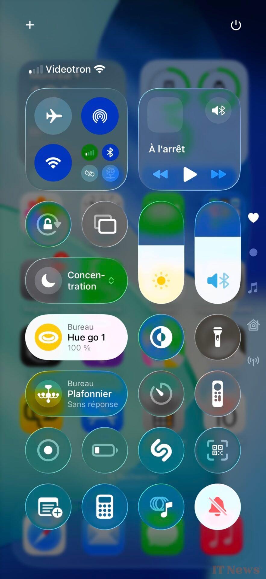
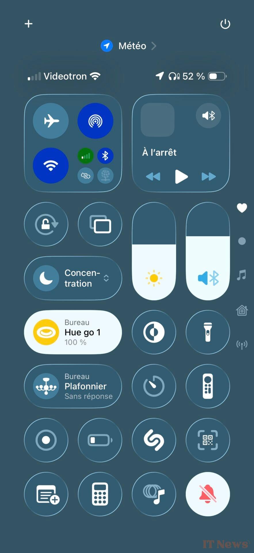
Below, the iOS 26 Control Center with transparency (left) and without transparency (right).
But users shouldn't have to rummage through settings to find a solution to a problem created by Apple. The manufacturer would be better advised to design its interfaces for the best possible readability. This summer will be a busy one for Apple developers, who will be multiplying betas and opportunities to add contrast to Liquid Metal elements.
It's difficult to be exhaustive since Liquid Glass concerns all of Apple's operating systems, from iOS 26 to macOS Tahoe 26, including watchOS 26. We can applaud Apple's desire for change, which nevertheless leaves users with plenty of customization options - not everyone will appreciate the combination of the translucent interface with the icons of the same barrel, which give the impression of handling glass. Liquid Glass is an open-air construction site, which we will be following closely in the coming months before the launch of iOS 26 this fall.


0 Comments