

The latest beta update for Android 16 hides a new design for the Settings home screen. Menu icons lose their gray for more colors.

Google has just deployed beta 4 of Android 16. This is a version close to stability and the release of the first final version of the update should not be long in coming. Since we are at the end of development, there are few new features integrated, but Android Authority has still managed to activate a new design for the Settings application.
The Settings home page, the one that displays all the menus you can access, gains in color and loses its sobriety. The icons of each category (Connectivity, Applications, Battery, Wallpaper, etc.) were grayed out on Android 15, they have a flashy look with the update. Update.
Android Settings Are Getting More Colorful
It seems Google has developed a code that assigns a color to each major set of options. For example, everything related to notifications, silent mode, ringtone control, and vibration is in pink. Settings related to the display and wallpaper are in orange. Everything related to security is in light blue, and accessibility is in purple. For wireless connectivity (Wi-Fi, Bluetooth), we have dark blue.
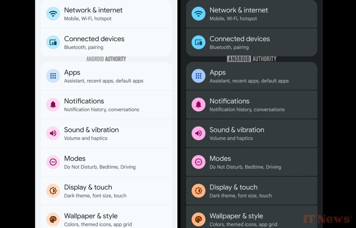
These changes make the Settings app more visually appealing and can help identify the menu we're interested in more quickly, as logos are more visible this way. Oppo's ColorOS and OnePlus' OxygenOS overlays, for example, already offer colored icons for the Settings menus, and the effect is quite successful. Google may have been inspired by this for this new design.
These changes are currently hidden, which means that Google is not ready to show them to users, even in beta. Colored icons will therefore not necessarily be available from the first stable version of Android 16. They will then probably arrive with an update. later date, or even with Android 17.
Source: Android Authority


0 Comments