

Google is simplifying the trip overview in the Android version of its Maps app. Easier to read and less cluttered, the new interface highlights what really matters when planning a trip: travel time, expected arrival time, and key information like tolls and savings.
A clearer display for your Google Maps trips
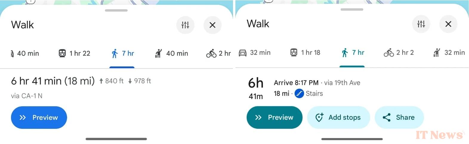
Gone are the three dense lines that left empty space: the journey time is now displayed on two, much larger lines, on the left side of the screen. It's colorful, readable, and above all, well thought out. for quick reading. A mention "Arrival at hh:mm" also appears, right next to the route, as "the fastest despite usual traffic".
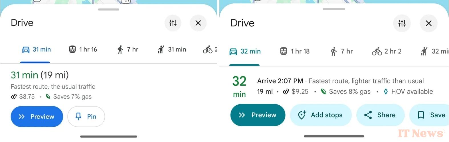
These adjustments improve readability without disrupting our routines. Distance, potential toll fees, and time savings remain clearly visible, but are better integrated. Everything remains perfectly readable.
An update that affects all types of transportation
Whether you're in a car, on a bike, on the subway, or on foot, this overhaul affects all the means you can use to get around. For those who plan their journeys in detail, having arrival times visible from the outset is a real plus. Overall, the information is more direct and better organized. The new version of the app is currently rolling out with Maps 25.13.06 on Android. On iOS, nothing new yet.
Source: 9to5Google


0 Comments