
"Oh, what a blunder!" That's what the person in charge of preparing the blog post about Google's new design specifications must have been thinking. On its blog dedicated to the design of its products, Google has indeed published a complete, detailed, and above all illustrated article on Material 3 Expressive, its new design guidelines. Spotted by 9to5Google, the blog post, published accidentally, has since been removed. But it is still accessible from the WayBack Machine.
Material 3 Expressive, Google's most significant graphical update
In this blog post, Google retraces all the research that has been done by its teams on this new graphical specification. The Mountain View firm explains that Material 3 Expressive is "the most in-depth update ever made." To arrive at this result, Google designers relied on the conclusions of a conversation during which it emerged that Google applications were too similar visually speaking, and that their interface did not arouse any emotion in the user.
Google then explains that its teams then carried out a collaborative investigation that required 46 research studies. No fewer than 18,000 people from around the world were involved in the research. By taking into account all the feedback from those surveyed, the design teams were able to establish the principles of Materiel 3 Expressive. The main objective of this new graphic charter is to make users feel something, to give emotion, to make them react.
To define the rules governing the specifications of Material 3 Expressive, the Google design team used several methods. It analyzed user eye tracking and assessed the emotional reactions of respondents to different designs. The Mountain View firm also collected user impressions and preferences, and assessed their understanding and use of interfaces. All of this research helped optimize certain aspects, such as perception of waiting time, button size, and the accessibility of new functions.
An expressive, cool, and easier-to-understand design
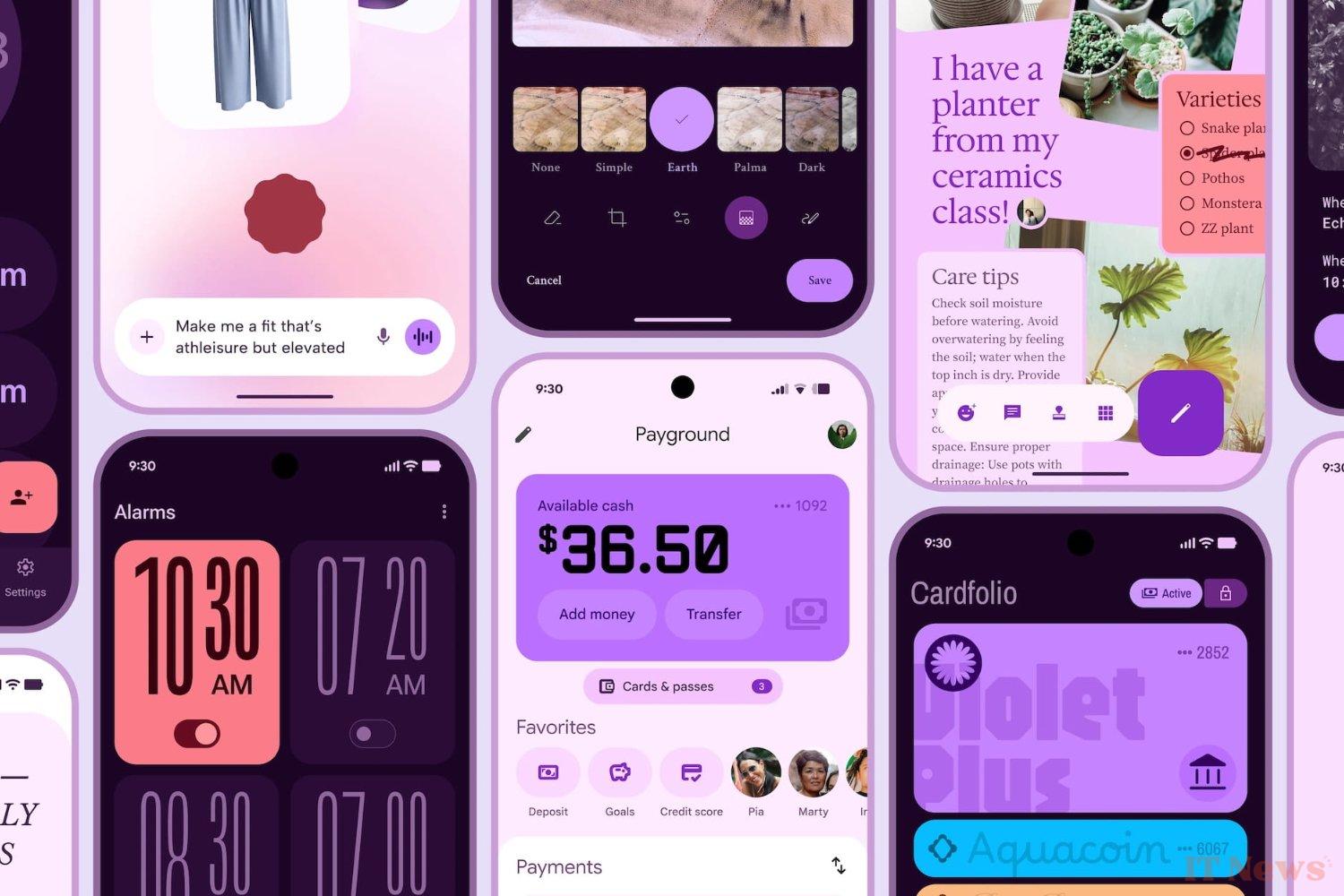
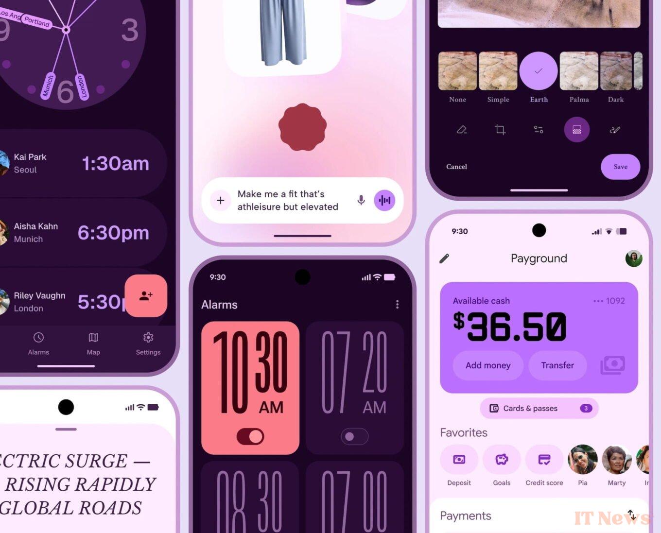
In broad terms, "The fundamental elements of expressive design are the use of color, shape, size, movement, and structure," explains Google. The firm is certain that "people prefer expressive designs," especially younger people, between 18 and 24 years old.
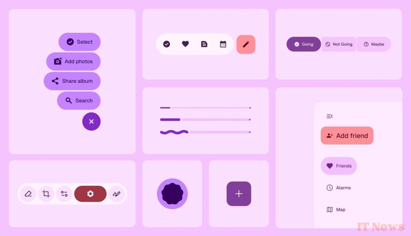
The comparison between a non-expressive interface and an expressive interface that respects the codes of Material 3 is clear. The example of the Gmail interface allows us to quickly realize this. The presence of a larger send button, located just above the keyboard, obviously seems much more practical.
That being said, Google explains that these graphic codes will have to be adapted according to the context of use. Because for the moment, it will not be directly applicable to certain applications that require order and sobriety.
One thing is certain, in any case, the changes brought by the specifications of Material 3 Expressive risk disrupting users' habits somewhat. But for Google, "This obstacle will diminish as this style becomes more widespread."
Source: 9to5Google


0 Comments