
For several months, Google has been modernizing the interface of its services with Material 3 Expressive, a more colorful version of its design. After Google Photos, Gmail, and Google Messages, it is now the turn of Google Chrome for Android to show the first signs of this evolution, starting with the management of tab groups.
Chrome for Android also adopts the colors of Material 3
The latest experimental version of Chrome (Canary 139) includes a notable change: tab groups are no longer just a simple colored dot. Thanks to a new setting that can be activated in this Canary version, the color assigned to a group now applies to the entire card of this group, which significantly improves readability. Here's what it looks like:
This change, spotted by @Leopeva64 on X, makes it easier to distinguish between multiple groups of open tabs. The expert also specifies that the interface for naming a group should eventually display colors as dots (rather than dots), although this part doesn't seem to be activated yet. These new features should appear in the stable version of Chrome 139, expected on July 30.
Other browser elements are moving to Material 3
In addition to tabs, Chrome's Android menu, the one accessible via the three vertical dots, is also getting a facelift. This update applies the Material 3 Expressive style to the icons in the menu in question. This brings the visual experience a little more in line with the rest of the Google ecosystem.
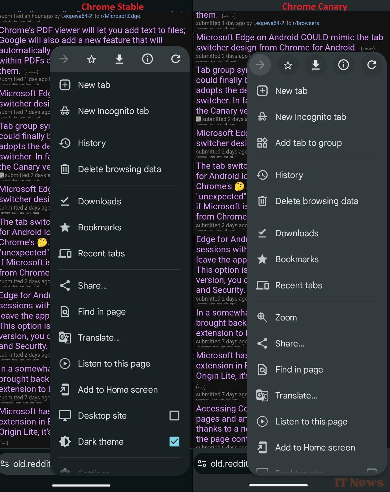
The Mountain View giant is therefore continuing its graphical unification work, both on Android 16 (currently in QPR1 beta) and in its main applications. A progressive deployment is gradually shaping the interface of Google services for the coming months.
Source: Android Police


0 Comments