
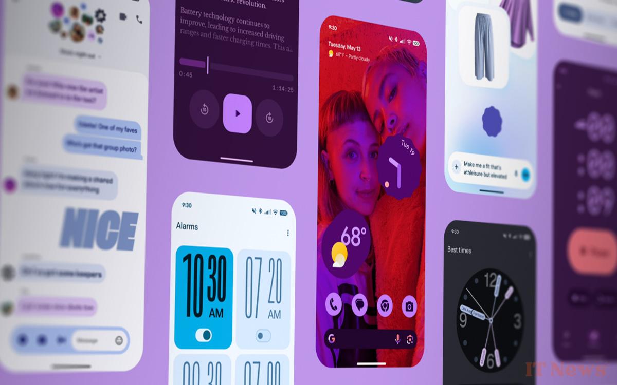
Google is rolling out the first beta for Android 16 QPR1, the first update the system will receive after its stable release. It allows you to see what the new Material 3 Expressive design looks like.
Like every year, the Google I/O conference was an opportunity to discover new services and new products developed by the Mountain View firm. The latest one was resolutely focused on artificial intelligence. No announcement regarding Pixel smartphones or Android 16, the next version expected for June 2025 if all goes well. For those disappointed, rest assured, Google has quietly corrected the situation by deploying the beta 1 of Android 16 QPR1.
To put it simply, this is the first update that Android 16 will receive after its global release. It is compatible with Pixel smartphones from the 6, up to the Pixel 9a. In other words, it is a preview of the future Pixel Drop, which adds exclusive features to the range. Android 16 QPR1 Beta 1 is above all an opportunity to see what the famous Material 3 Expressive looks like, the design that reinvents the Android interface.
Here are the new features of Android 16 QPR1 Beta 1 in pictures
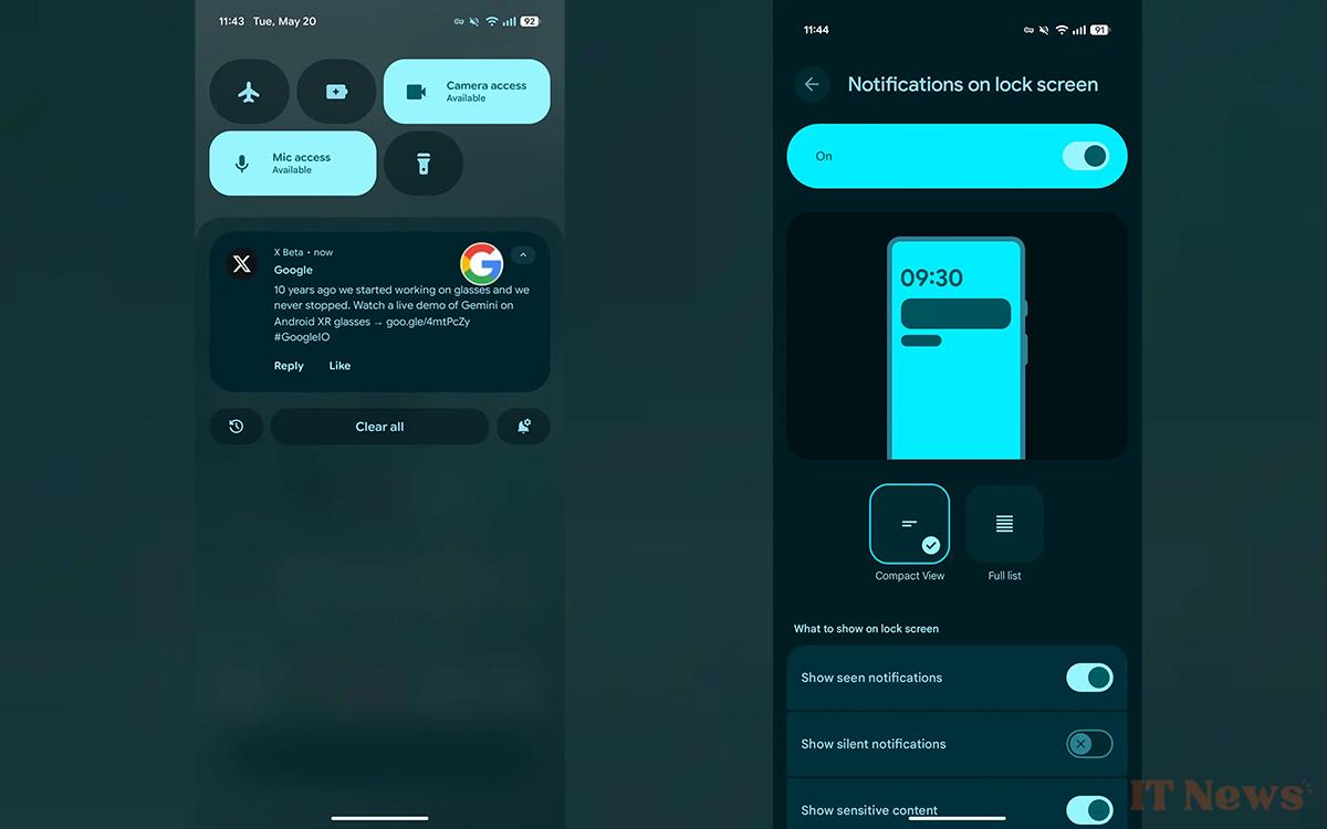
Our colleagues at 9to5Google have dived into the beta. Generally speaking, Android's display is finally getting rounded. The few corners that were too straight disappear, giving way to curves. This is particularly obvious in multitasking, for example, which now benefits from a drop-down menu offering various options such as splitting the screen or triggering a capture.

Same story with notifications. Every icon is rounded, which for some will give the impression of an airy display, for others a waste of space. However, we can admit that the readability of the whole is very good.
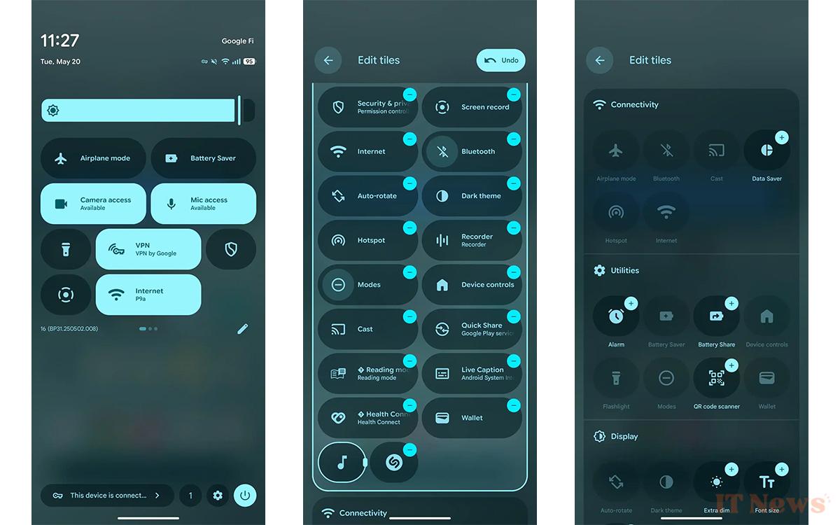
On the Quick Settings side, Android 16 offers a new, more customizable layout, where you can make certain tiles wider than others. Note the bar that marks the brightness slider level. We find the same thing on the sound slider.
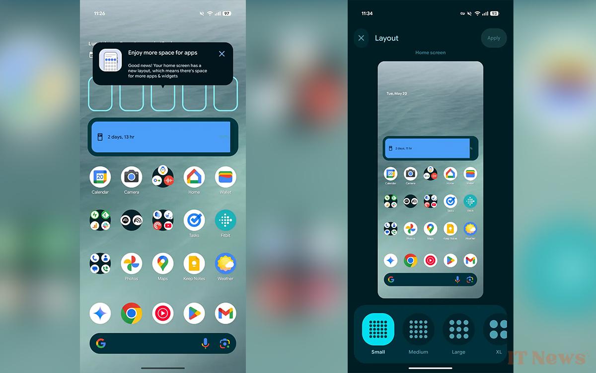
Among the other new features, we find a change in the layout of applications when you open the drawer. Rather than being displayed full screen, they appear on a separate page. Let's finish with the smartphone desktop, where the grid size is no longer the same. The ones that are offered no longer display the number of applications displayed per row and per column, but “Small“, “Medium“, “Large“, etc.


0 Comments