
Since 2015, Google's colorful "G" has established itself as an essential visual marker of our digital lives. Appearing on countless screens and applications, it's changing today. The search giant is now experimenting with a revamped version, which abandons sharp separations for a continuous gradient of rainbow colors. A redesign that comes just days before the Google I/O 2025 conference.
A new visual identity for Google's G logo
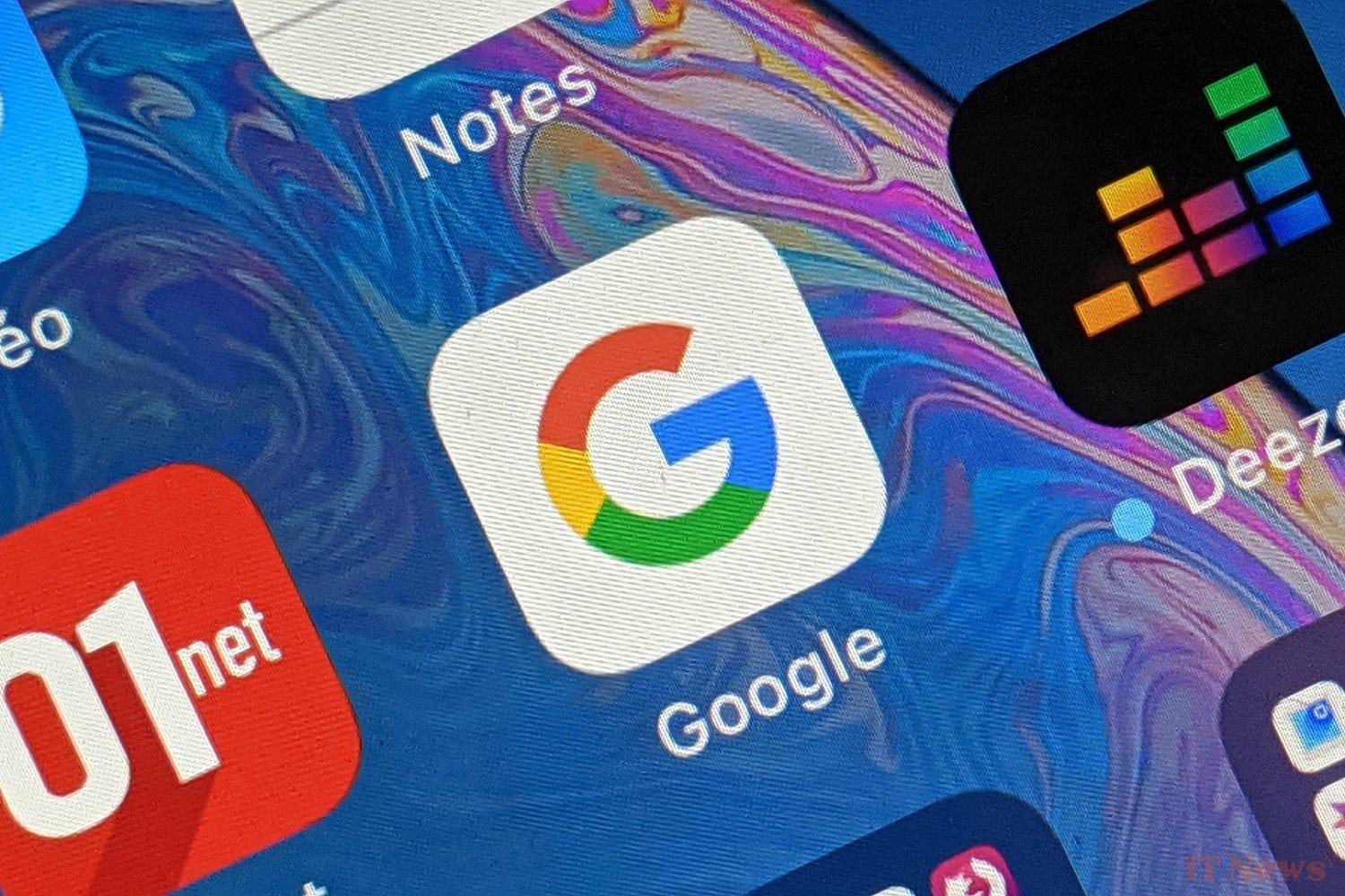
Without making waves, Google is starting to roll out a revisited version of its G logo on mobile. The icon, still faithful to the blue, red, yellow, and green palette, now adopts a color gradient. This change was first observed on the Google Search app for iOS, then confirmed on Android in beta version 16.18.37.sa.arm64. However, it remains limited to these environments for now. Neither Gmail, nor Google Maps, nor Google Photos seem to be affected by this graphical evolution yet. The new G logo maintains its readability, while bringing a welcome touch of freshness.
The old Google logo (2015) on the left, the new one on the right (2025). – © Google
At this stage, the new gradient G only appears in a very limited number of apps, and Google has not yet officially communicated on this update. This timing, however, leaves nothing to chance. Indeed, the annual Google I/O 2025 conference, scheduled for May 21, is fast approaching.
This event, often synonymous with major announcements in terms of design, services, and AI, could offer Google an ideal opportunity to formalize this logo change and perhaps announce a more comprehensive overhaul of its visual identity, as seems to be the case for Android 16.
The change of the Google logo on Android on the left and on iOS on the right. Source: 9to5Google
This graphic facelift could well mark the beginning of a more significant transition in the Google universe, especially if the company decides to apply this new aesthetic to all of its icons. What do you think of this new logo?
Source: 9to5Google


0 Comments