
Google has (unintentionally) lifted the veil on a major visual overhaul of Android: Material 3 Expressive. The change was first glimpsed in a blog post and then quickly deleted, but not quickly enough to escape a few curious onlookers. According to these documents, this is the most studied redesign ever carried out by the Google design team, with no fewer than 46 research cycles and more than 18,000 participants.
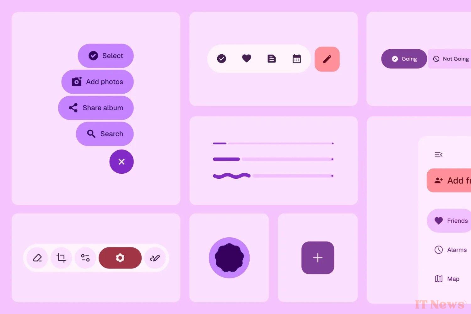
A design designed to provoke emotion
Objective: to make the interface more intuitive, faster to understand, but also more pleasant. "Expressive design evokes emotion," summarizes the team, who want to inject a little emotion into a digital universe that is often too smooth. Concretely, this translates into the strategic use of colors, shapes, sizes, and movement to guide the user's attention. A larger, more visible, and better positioned send button, for example, allows for faster action: up to four times faster than in the current version of Material 3.
But it's not just a question of speed. Tests have shown that the new interfaces smooth out certain inequalities. Users over 45, traditionally slower to interact with an interface, react here as quickly as younger users. And the improvements also benefit accessibility: button sizes, contrasts, and interactive areas have been revised to suit all profiles.
According to Google, this new design increases the perception of modernity (+34%), boldness (+30%), and "cultural relevance" (+32%) of a product. In other words, Material 3 Expressive interfaces give a brand a facelift, making it more attractive and desirable. But be careful not to get carried away: "this is not a universal solution," warns the search giant.
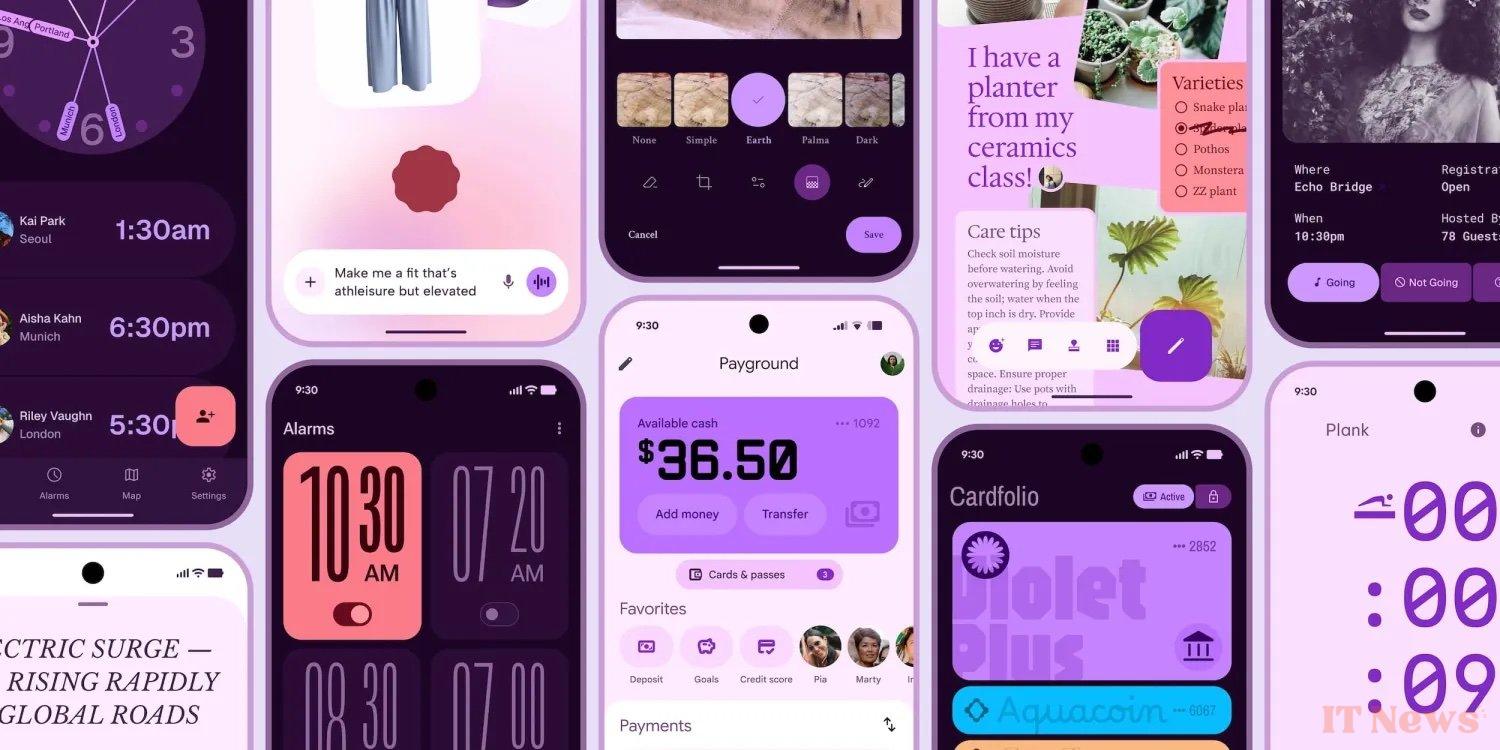
Tests have proven it: removing labels or disrupting traditional visual cues too much can ruin the experience. In an overly experimental version of a music player, users were seduced by the appearance... but lost in the use. Hence the importance of respecting best practices, while maintaining a margin for creativity.
The new design will be presented in detail at Google I/O, the annual developer conference. In the meantime, some clues suggest that it could already begin to infiltrate Android: reworked icons, modified clock font, redesigned quick settings menu, etc. It remains to be seen when Google will officially make the news, this time voluntarily.


0 Comments