

After several months of testing, the latest version of the Google Search app for Android rolls out a new "Activity" tab. It takes place in the bottom bar of the screen, replacing the "Saved" tab. The goal: to centralize recent searches, pages viewed, and saved items in a clearer interface.
A faster search history to consult on the Google app
The "Activity" tab, visible at the bottom right of the screen, groups together three main sections. The first, dedicated to history, displays the last four searches and the pages viewed from the application. Each result is presented as a card with the date, time, domain name, and site favicon.

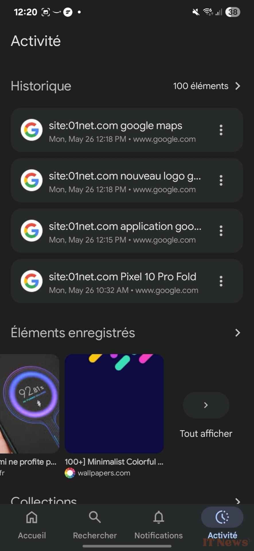
The new "Activity" tab of the Google application. – Source: 01net
By clicking on the three small dots of a search, you can save, share, or delete it. By tapping on the total number of items, you access the complete list of your searches, without having to go through your Google account settings.
Collections and saved items all in one place
The other two sections of the tab concern saved content. The "Saved Items" section displays, in a visual carousel, all the items you've set aside: websites, images, places on Google Maps, products, movies, or series. Further down, the "Collections" section groups this content by themes or personalized folders, as was already the case before.
Note that users nostalgic for the old "Saved" tab can still access it via the Google Account menu, in the "Savings and Collections" section. This redesign is currently being rolled out with version 16.19 of the Google app. The company is also taking the opportunity to harmonize its design, by toning down the colors of certain cards, to better match the aesthetic of the AI mode, which is still not deployed in our country.
Source: 9to5Google


0 Comments