
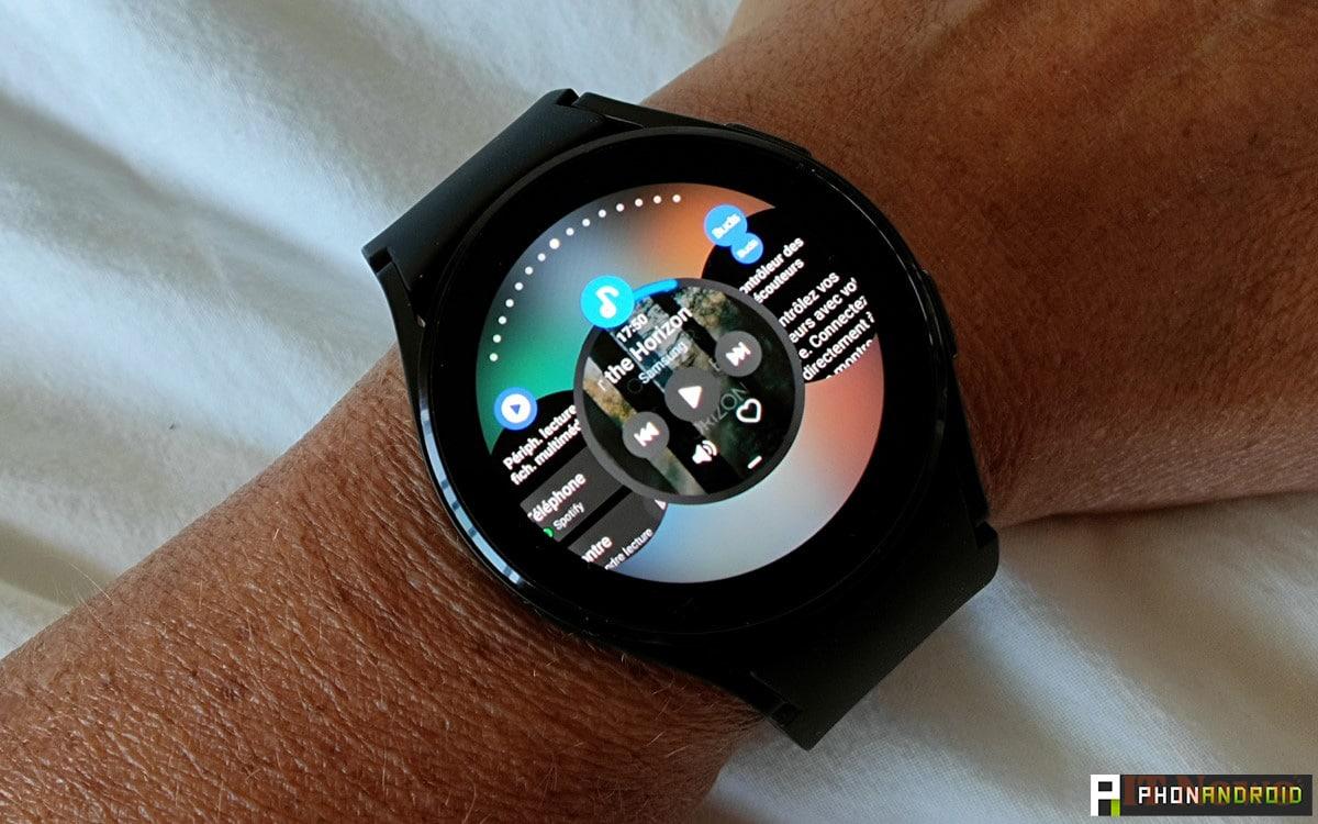
A major visual change is coming to Wear OS smartwatches. Two well-known apps are already starting to show off this new look. This is just the beginning, but it heralds a broader overhaul of the entire Google ecosystem.

Google is preparing to generalize its new visual language called Material You Expressive, an evolution of Material You, already used on Android. This more lively, colorful, and modular style will officially arrive with Android 16 in September. But without waiting for this update, the company is starting to quietly introduce it into certain applications on Wear OS 5, its operating system for smartwatches. The goal is clear: to unify the appearance of apps on smartphones and watches.
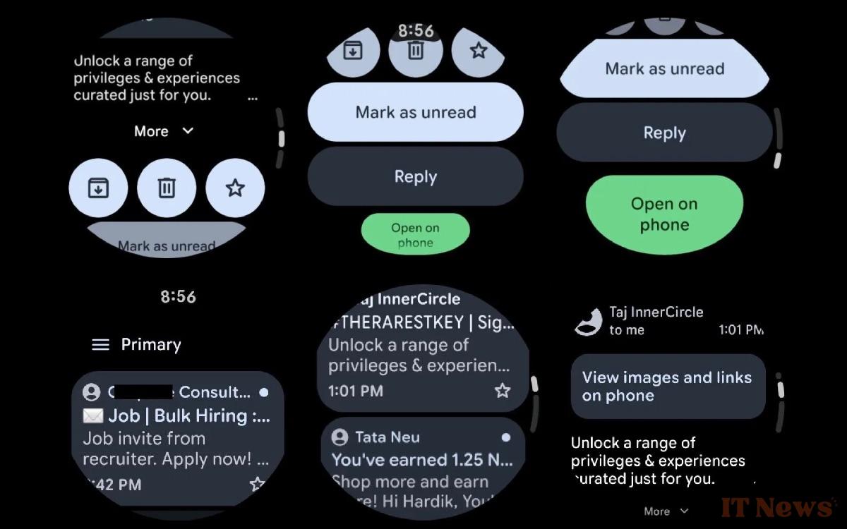
Two main applications already display this change: Google Maps and Gmail. The first users are spotting these new interfaces on their Pixel Watch or their Galaxy Watch. The deployment is not yet widespread, but the differences are already visible. The focus is on larger buttons, bolder colors, and a more thoughtful layout for small, circular screens.
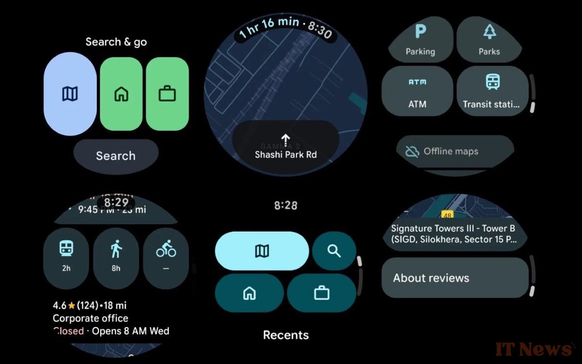
Google Maps and Gmail are gradually adopting Material You Expressive on Wear OS
In Google Maps, the new interface offers large, colorful icons, More visible navigation buttons and direct access to frequently used addresses like "Home" or "Work." Travel modes are now displayed as compact dots, better suited to quick gestures on a touchscreen. This new look was spotted by Telegram user Hardik, who shared screenshots taken on a Galaxy Watch 4 running version 25.23.01 of the app. On the Gmail side, buttons like "Reply," "Mark as Unread," and "Open on Phone" also change shape and color. Some elements are larger, backgrounds become more expressive, and the overall organization is more intuitive. These adjustments follow the same lines as the recent changes made to Google Keep, already redesigned for Wear OS with similar elements.
This design aims to make the interface more readable, more accessible, and above all, more consistent on circular screens. Google seems to want to harmonize all of its applications around a common style, whether for smartphones, watches, or soon tablets. These first changes clearly show the direction being taken, even if their deployment remains limited.


0 Comments