
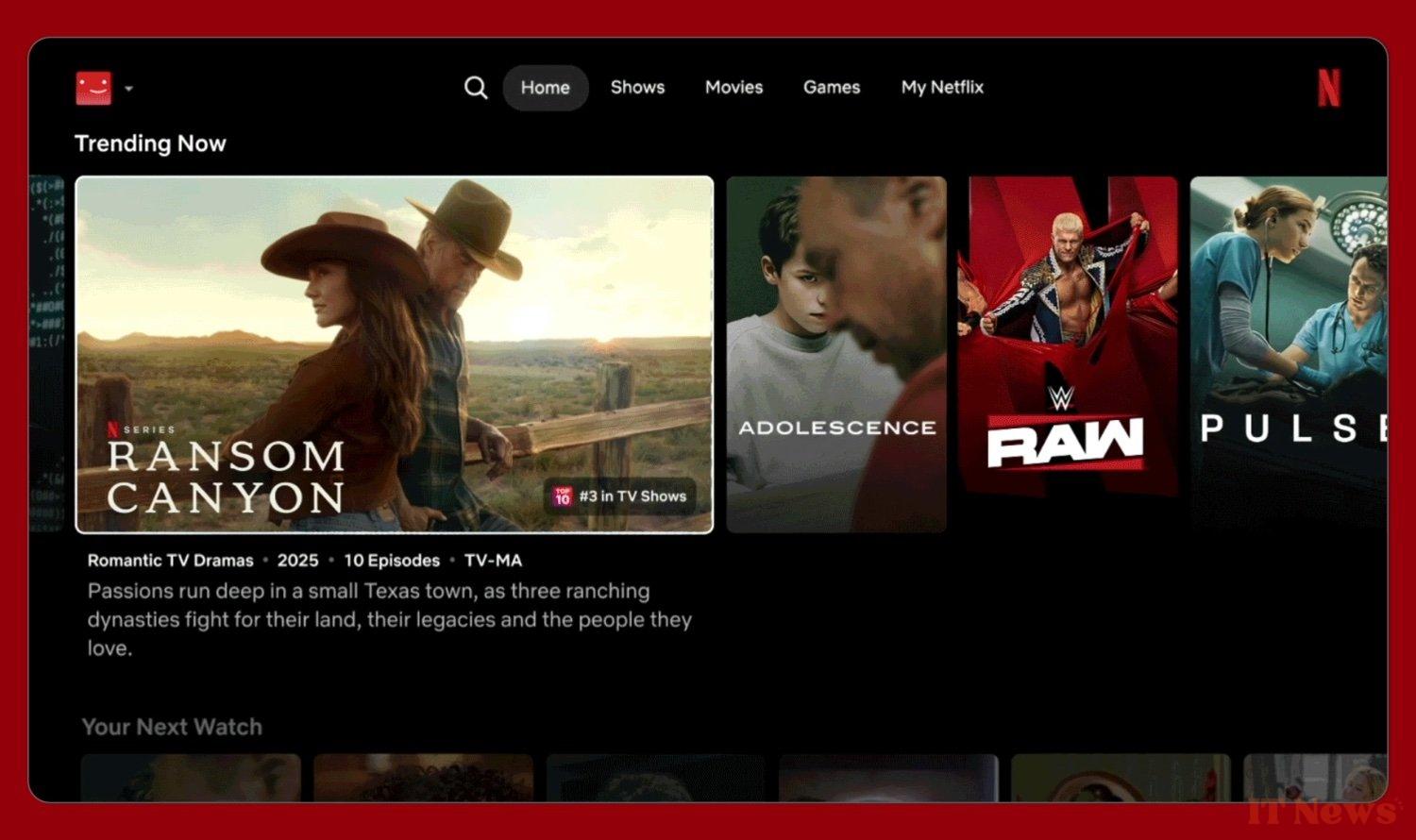
Netflix gave its smart TV app interface a serious overhaul in early May. Gone is the side navigation; the menus are now centered and at the top of the screen. And while the visuals are larger, it's also to include information like a synopsis, the cast, the number of awards, and more.
Less content on screen
This new design, combined with a much more aggressive recommendation system, is currently being rolled out on Samsung and LG TVs. Eventually, everyone will be served. But the first criticisms have already been poured in. One of the complaints I often read about on Reddit is that the app window displays fewer options than before—obviously, the thumbnails have gotten bigger. Some compare the app to the tablet version, even though TV screens are much larger.
As a result, we find ourselves navigating the interface much more, which makes the selection process (the most painful part of Netflix) even longer. Obviously, this is not the reaction the platform was hoping for. Netflix, however, responds by pointing out that changes to interfaces always provoke knee-jerk reactions, whether on Spotify, YouTube, Instagram, or elsewhere. This is especially true for an interface that hasn't changed in ten years.
Netflix's redesign was well-received during the year-long beta test, however. More users said they preferred the new interface over the old one. "With larger thumbnails, we're showing more information upfront to help you make a better choice," a spokesperson told the Hollywood Reporter. "Instead of seeing 20 or 30 titles at once, you now have an immediate overview of the content."
Will the message get through to the angriest viewers? After all, it's largely thanks to its usability that Netflix has managed to stay ahead of its competitors. The platform is playing a risky card here...
Source: Hollywood Reporter


0 Comments