
Google continues to roll out its new visual language across its apps. The latest to benefit: the Play Store, which now displays more colorful icons in its search tab.
More visible search shortcuts for the Play Store
In version 46.5.19 of the Play Store, some users have noticed a significant visual change in the search tab. Instead of the discreet blue icons used until now, we now see colorful pictograms that better differentiate the shortcuts. The design of the icons remains largely the same, but their new graphic treatment is more eye-catching.
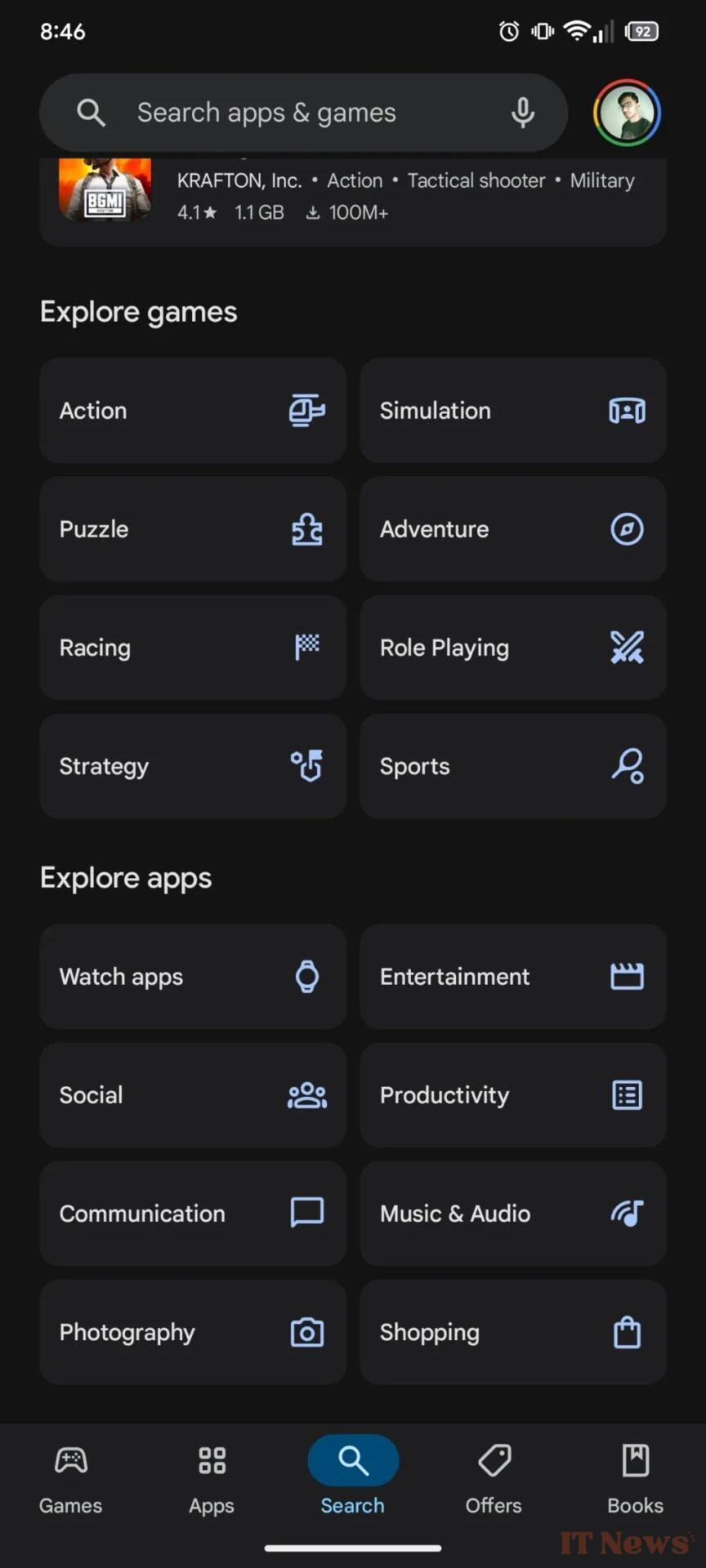
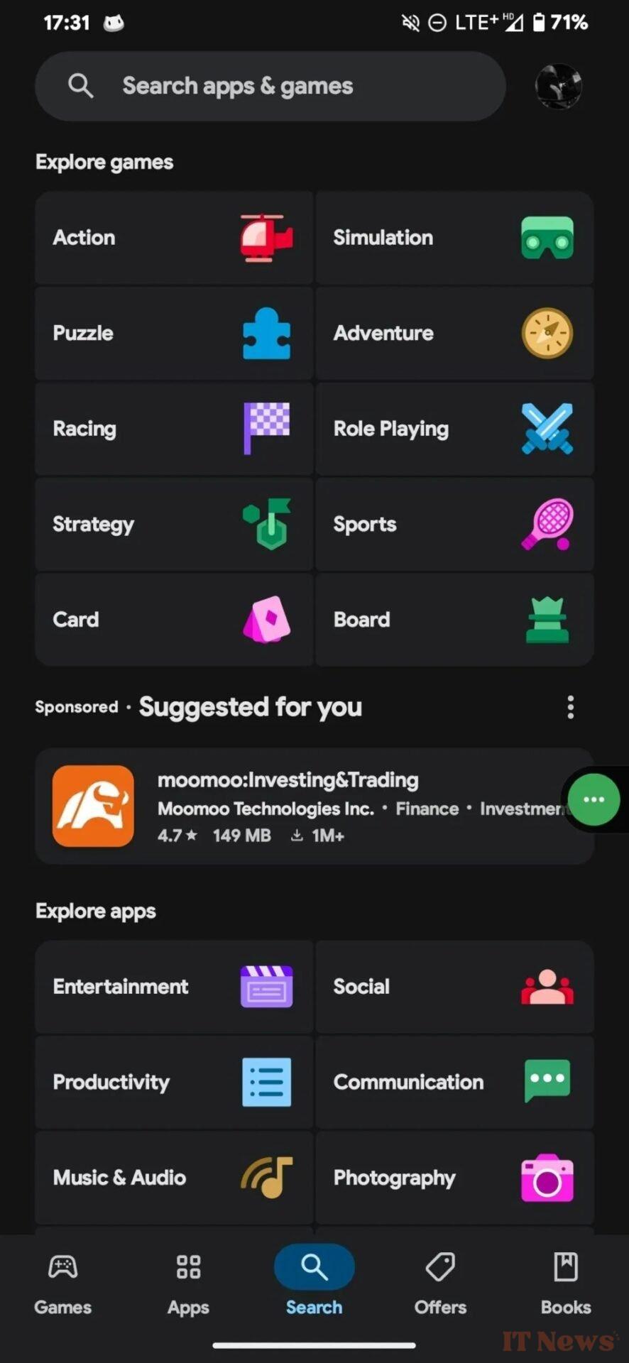
The Google Play Store search tab: the old design on the left, the new one on the right. – Source: Android Authority
This change was spotted by user @Leontylerz on Telegram. It appears to be a server-side test, meaning not all users are seeing this new interface yet. If the Play Store search tab still displays the old icons on your phone, that's normal.
Material 3 Expressive extends to Google apps
With this update, Google continues to generalize the Material 3 Expressive aesthetic across Android 16, whose new design is still awaited. This graphic approach gives central place to color, visual hierarchy, and customization. The Play Store therefore joins other in-house applications like Google Calendar, Gmail, and the Phone app, which are already being redesigned.
The objective is clear: to make the interface more intuitive and pleasant to use, while facilitating navigation thanks to more differentiated visual elements. This new look for the Play Store is just a glimpse of the many visual changes coming to the Android ecosystem.
Source: Android Authority


0 Comments