
The Gmail app on iOS is getting an update that changes its interface by adopting Material 3, the latest design implemented by Google for its applications. This change notably translates into a new style of interface elements and a transition to a blue accent color.
A modernized and more consistent design for Gmail on iPhone
One of the main changes in this update concerns the search bar, which adopts a pill shape rather than a simple rounded rectangle. Similarly, the bottom navigation bar, available to users who have enabled Google Chat and Meet, highlights the active tab with a pill shape instead of simply coloring the icon.
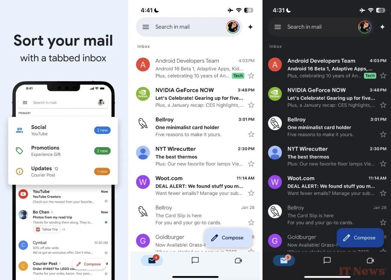
Red, the color historically associated with Gmail, is largely disappearing in favor of blue, used as the main hue. Depending on the mode (light or dark), different shades are applied for a more harmonious rendering.
Another notable change concerns the floating button for composing an email "New message", which takes the form of a rounded rectangle. In dark mode, it adopts a more pronounced blue tint. On the other hand, the side navigation menu, accessible via the hamburger icon, does not appear to have been modified.
Other subtle adjustments
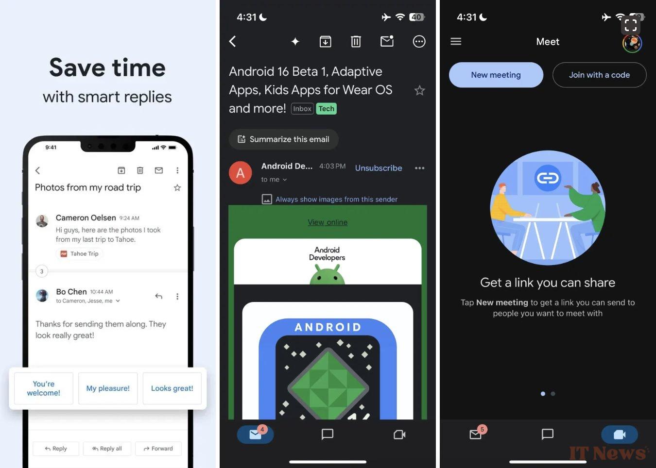
When opening an email, you will notice that the options icon at the top right changes from a trio of vertical dots to three horizontal dots placed in a circle. While Google has already rolled out Material 3 to other apps on iOS, like Google Chat, Maps, Photos, and Translate, some remain unchanged. Services like Drive, Docs, Sheets, and Meet have yet to receive the update.
Unlike Android, where Material You lets you adjust the colors of apps to match your wallpaper, this flexibility isn’t available on iOS yet. Google could have offered a customization option based on user account or a sync mechanism with Android, but that’s not the case for now. This update to the iPhone and iPad app is now available via Gmail version 6.0.250119.
Source: 9to5Google


0 Comments