

Google Messages is experimenting with a new interface, with a sleek, but also duller design. In the latest beta version, several interface elements have been redesigned, such as messages, shortcuts, emojis, and the search bar.
Google Messages removes color to improve readability
Google Messages is used daily by millions of people. With its beta version v20250408, the application is taking an aesthetic turn that may not please everyone. everyone: a more neutral background, more marked contrasts, and a gradual disappearance of bright colors. We feel the desire Google's move to emphasize the content rather than the container, while slightly modernizing the design of its messaging application.
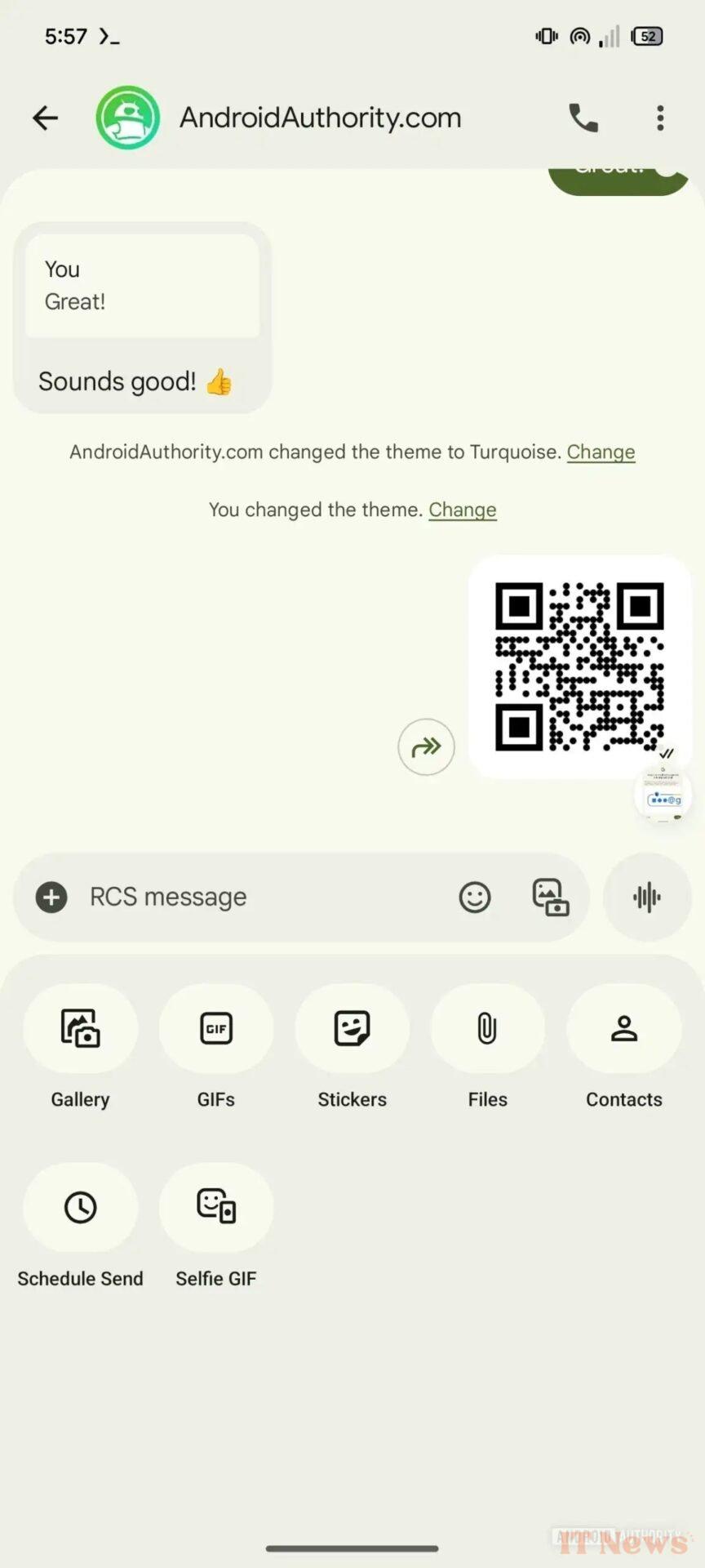
The current interface on the left, the new interface currently being tested on the right. – Source: Android Authority
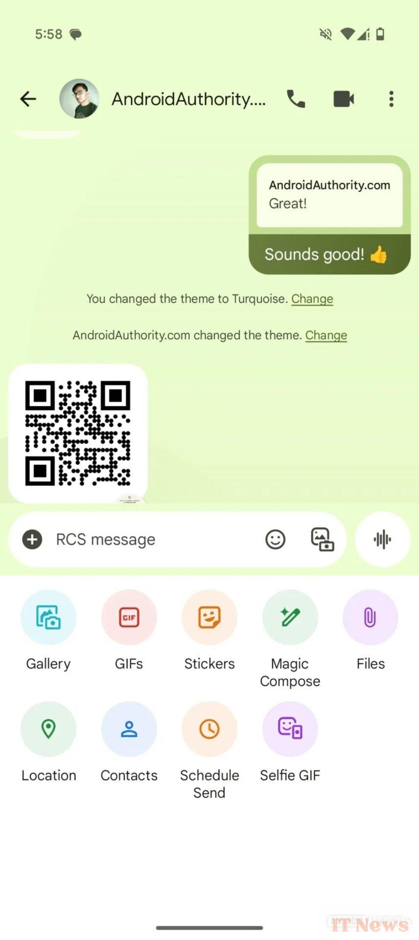
In the main conversation window, the contrast between sent and received messages is more pronounced, thanks to a background that we will describe as... grayish. The bottom corners of the header are also more rounded. Even the attachments menu abandons its colorful hues in favor of monochrome icons, for greater visual consistency... Did you say austere?
A reorganization of the interface
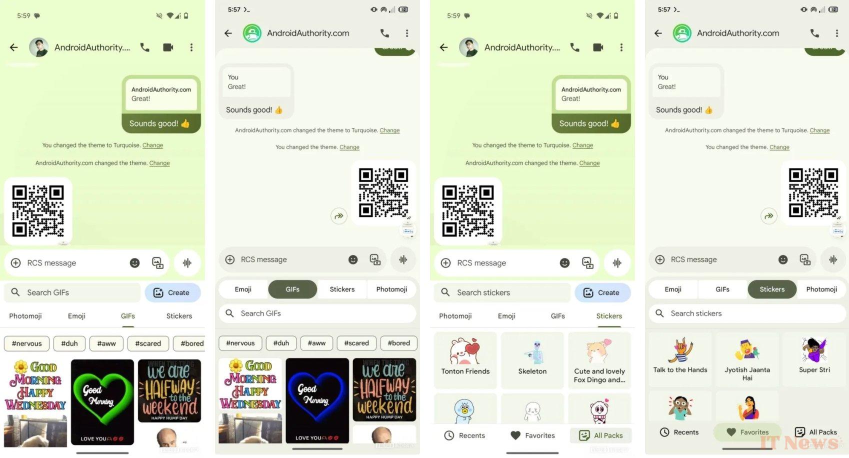
From left to right: current interface, new interface, current interface, and new interface. – Source: Android Authority
Beyond In addition to style, Google is also revising the hierarchy of displayed elements. The Photomoji tab, which allows you to create personalized emojis from photos, has been relegated to the end of the list. This is quite logical since we use classic emojis much more in our daily lives than Photomojis (right?).
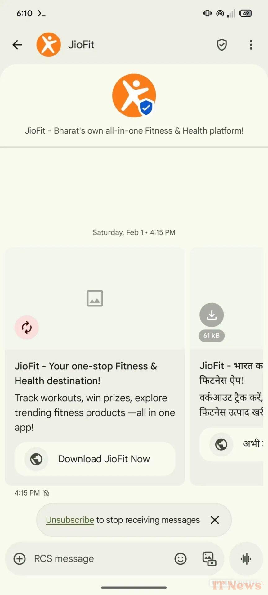
Another significant change: the search field is no longer located directly above the message writing area. It now moves to the top of the screen, which reduces confusion between the two fields. The "Create a Photomoji" button, previously highlighted, is now Now integrated more discreetly. As for the tabs, they adopt a presentation that better adheres to Google's Material Design principles. Commercial messages via RCS also benefit from some adjustments: the call-to-action buttons The action becomes more visible, as does the unsubscribe button at the bottom of the screen.
Source: Android Authority


0 Comments