

Google is launching a new design for account switching in almost all of its mobile apps. Fortunately, nothing that will disrupt your habits. Here's what's changing.
A personal account and a professional account. Unless you have two smartphones, it's likely that you juggle at least two Google accounts on your mobile. Even if it's just in Gmail, so as not to flood your work address with private messages, and vice versa.
If you're used to doing this, you've probably noticed a small recent change in the majority of applications developed by the Mountain View firm. Google is in fact in the process of generalizing a new layout for the account selector. Let's take a look.
Switching between your accounts is becoming more intuitive on almost every Google app
In the screenshot below, you can see on the left the old account switching interface, the one that appears when you tap your avatar in the top right corner of a Google app. The new layout, in the middle and on the right of the image, greets you with a large “Hello[first name]!” followed by the button to Manage your Google account. The latter benefits from the redesign to round off, in line with the new Material 3 Expressive design that we will see fully in Android 16.
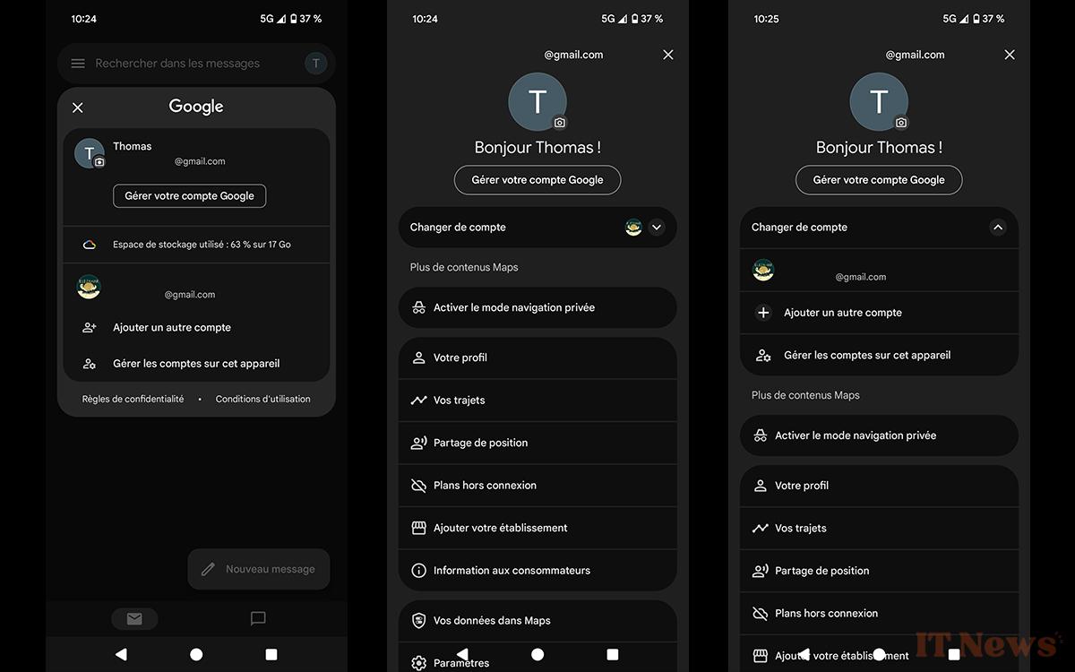
The option to Change account is placed directly after, in a box that is quite separate from the others. In the end, the change is quite minimal. It's mainly about harmonizing Google services between mobile and web, the latter having already benefited from this account switching interface for about 2 years. At the time of publishing this article, it is visible in most of the most used Google applications on Android:
- Google Docs, Sheets, Slides and Drive
- Google Maps
- Google Keep and Tasks
The other applications will receive the same treatment in the coming weeks. Note that Gmail, although the first to have displayed the redesigned account switcher, has not yet benefited from it. Its deployment has in fact been suspended.


0 Comments