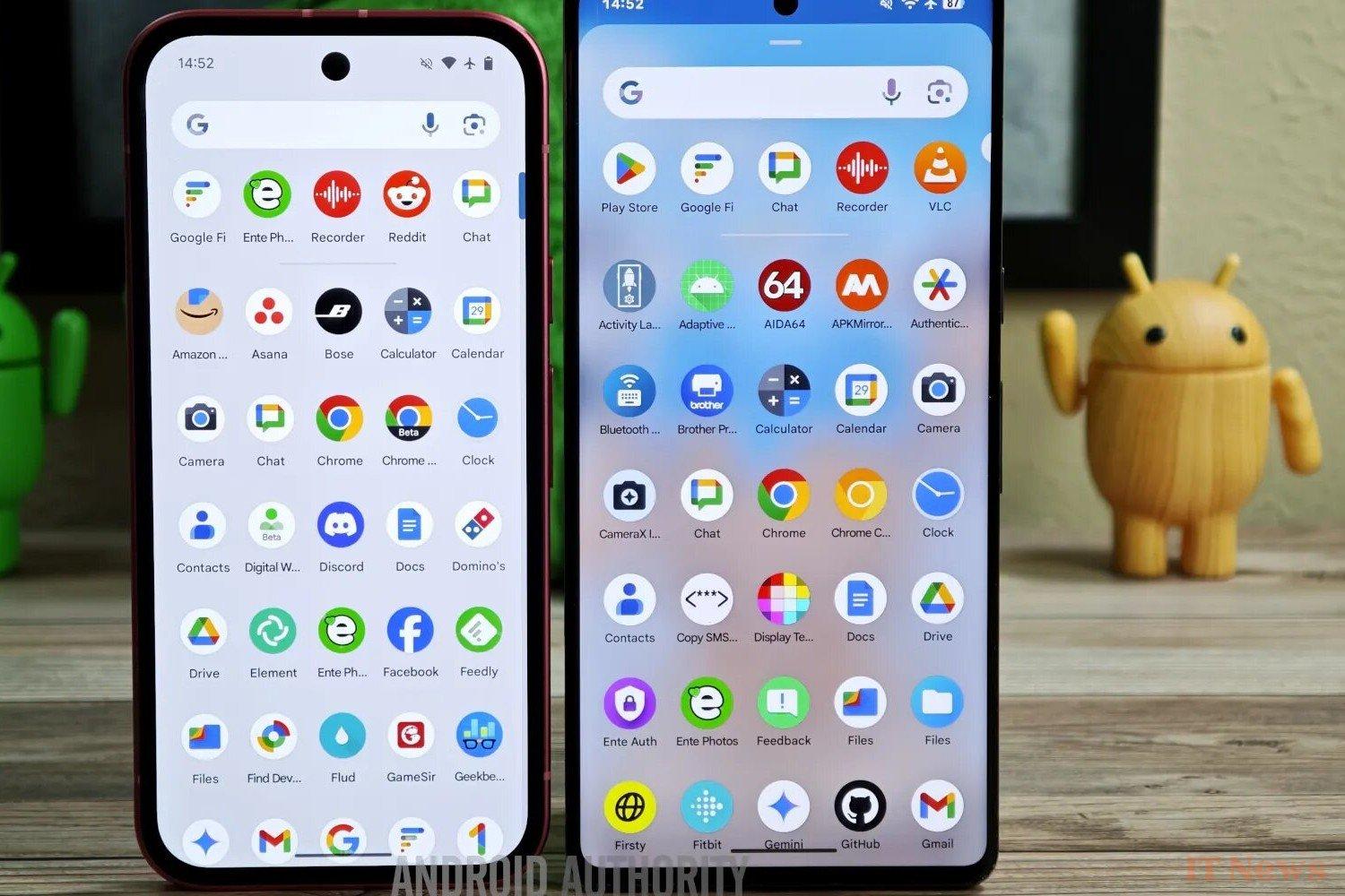
Like Microsoft with Windows, Google regularly revamps the look of Android. Android 16 beta 4 hides numerous facelifts, uncovered by Android Authority.
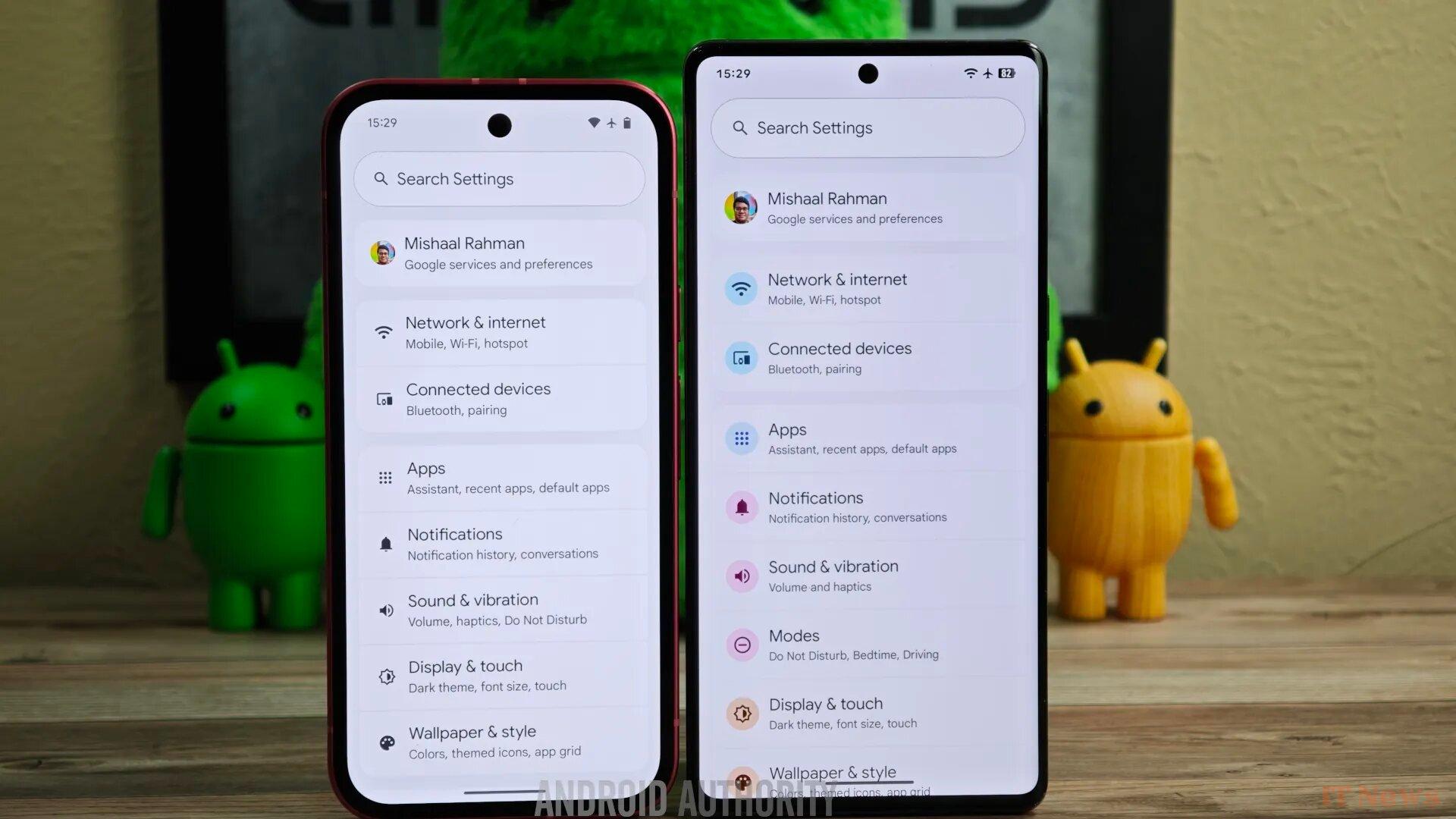
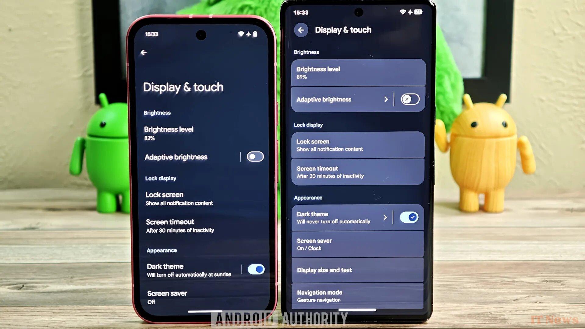
The source article is full of visuals, most often presented in the form of comparisons. As you might expect, the idea here isn't to give a complete tour of the property: we'll focus on the most significant changes. Let's clarify once and for all that in each image, the old version is on the left; the tested one is therefore on the right.
A facelift with a Material 3 Expressive brush
As our colleague points out, these are hidden design changes in Android 16 beta 4: they are not enabled by default. However, we can expect Google to formalize some of them at the Android Show, or directly at the I/O 2025 conference scheduled for next month (May 20 and 21). Indeed, the company is working on a new version of Material Design, called Material 3 Expressive. However, according to the source, this complete overhaul should not appear immediately in the stable version of Android 16; rather, it will arrive partially in a quarterly update. Without further ado, here are the developments.
Changes are visible from the status bar. The icons (Wi-Fi, 5G, battery, etc.) have been redesigned, as has the clock font.
Another notable redesign is the quick settings and notifications panel. Along the same lines, an optional setting now allows you to reduce notifications on the lock screen to a simple dot.
Furthermore, in this stock version of Android, several backgrounds become blurred. Don't be surprised if your smartphone already offers one: many overlays, like Xiaomi HyperOS, already use this type of effect.
A complete facelift
The volume settings also have a new look. Apparently, Google is still experimenting: Android 15 had already introduced changes at this level.
Let's finish this – non-exhaustive – review with the Settings page, which has colorful icons. Inside, the blocks stand out more, and the sliders now display a symbol indicating their state (enabled or disabled).
We've intentionally left out some smaller changes. For a complete overview, we invite you to consult the Android Authority article.
Source: Android Authority


0 Comments