

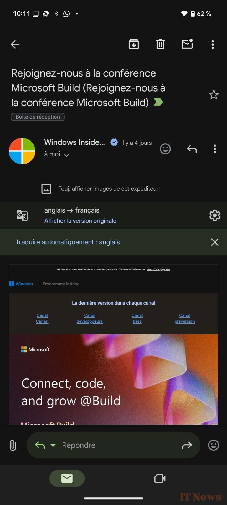
Google has just changed the quick reply interface in its Gmail app on Android. The app, which until now displayed an input field allowing you to reply to an email on the fly, is disappearing in favor of a new toolbar that seems much less practical to use.
A toolbar for replying to the bottom of emails
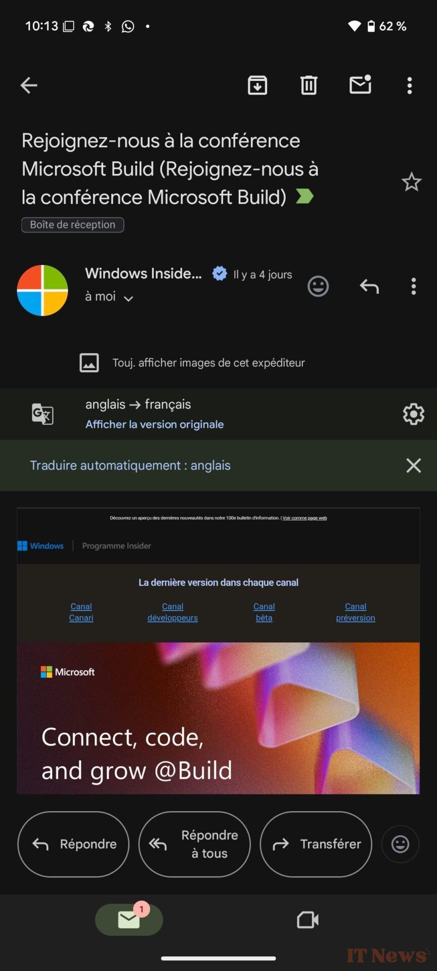
For its new quick reply interface, Google has decided to add four persistent buttons to the bottom of the emails you read. You now have the choice to Reply, Reply to all, Forward, or react to the message using an emoji. In the case of a reply, a new dedicated window appears.
Is this a mistake? Because this design change made by Google raises questions. The new system adopted in Gmail seems quite counterproductive. Whereas the old interface allowed you to quickly respond to a message while continuing to read it, the new one is much less practical in use. On the one hand, it takes up a lot of space, but it also adds a step, and then requires you to tap the three little dots if you want to view the content of the message you are replying to.
A job half done?
But the worst thing about this new interface is that the job seems to be incomplete. Indeed, while this new reply bar appears perfectly on some devices, it is not the case on all. On a Pixel smartphone, the buttons in this toolbar are perfectly displayed.
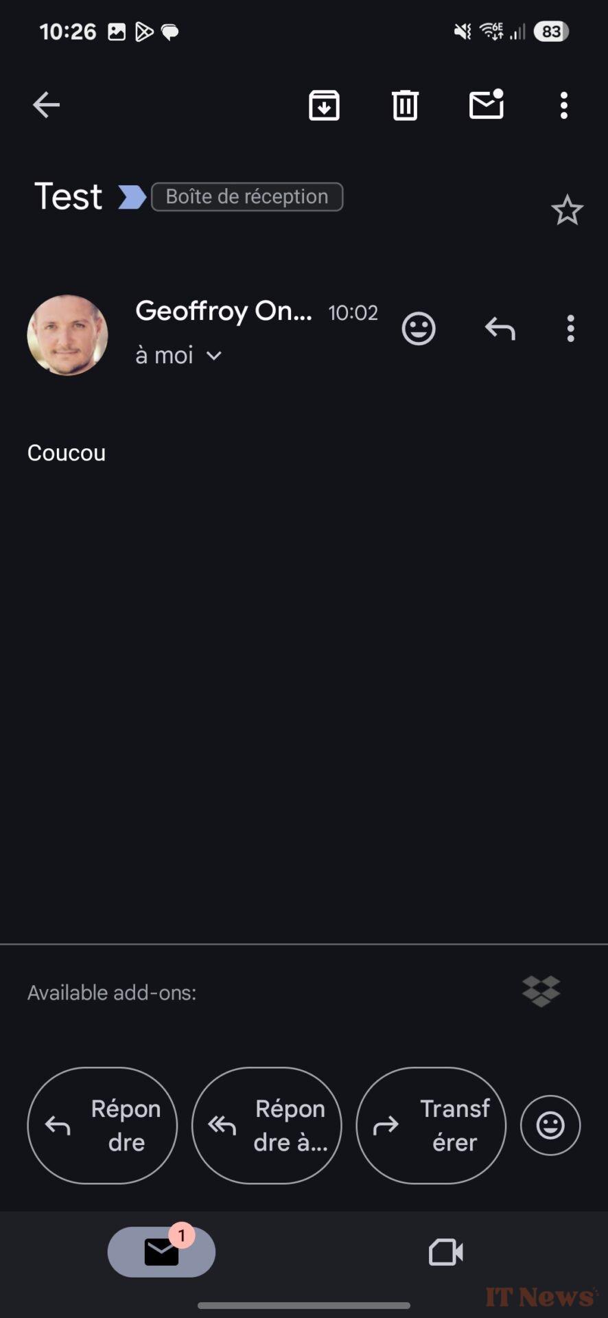
On the other hand, on a Samsung Galaxy S25, the text displayed on the buttons is too long (or too big) to be displayed on a single line, even when reducing the font size to the minimum. A disaster.
This new reply bar appears to be enabled with the 2025.05.04.x update that Google is currently rolling out.
Source: 9to5Google


0 Comments